

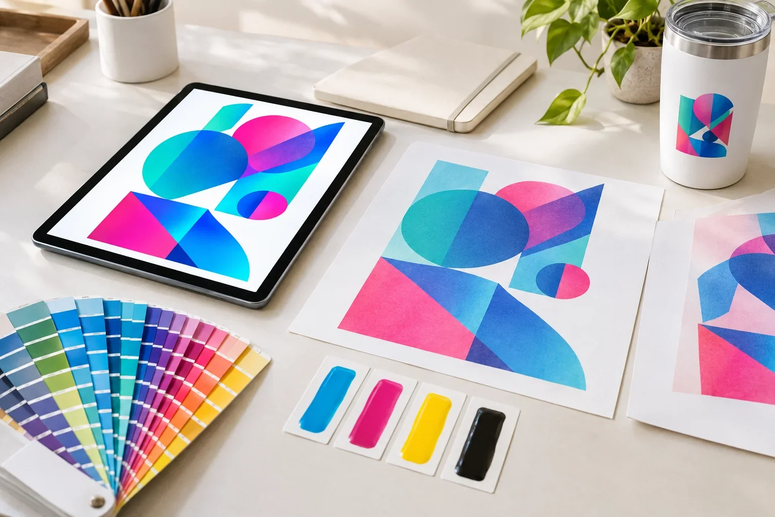
Quick Answer
RGB stands for Red, Green, and Blue. It is a color system used by digital screens, including computers, phones, and tablets. CMYK stands for Cyan, Magenta, Yellow, and Key (Black). It is a color system commonly used in full color printing. RGB creates colors using light, while CMYK creates colors using ink. Because these systems reproduce color differently, some colors that look vibrant on a screen cannot be reproduced exactly using standard CMYK inks.
You've probably experienced this before. Your company logo looks bright and colorful on your computer. The blue is just right, the pink really pops, and everything looks perfect.
Then you receive a printed sample, and something seems different.
The bright blue looks slightly darker. The vibrant pink is not quite as intense. Maybe that electric green has lost some of its glow.
Does that mean something went wrong?
Not necessarily. Digital screens and physical printing processes create colors in fundamentally different ways. Some differences are a normal part of reproducing artwork on physical products.
Let's look at what RGB and CMYK actually mean, why the differences matter, and how they affect your custom promotional products.
RGB vs. CMYK: What's the Difference?
The easiest way to understand RGB and CMYK is to think about where the color comes from.
A computer screen produces light. A printed product reflects light.
That difference changes how colors are created and how they appear to your eyes.
Two Different Ways to Create Color
RGB uses light to create colors. CMYK uses ink to reproduce colors on physical surfaces.
RGB: Digital Screens
Red + Green + Blue
- Uses light to produce colors
- Common on computers, phones, and tablets
- Can display many bright, highly saturated colors
- Common for websites and digital graphics
- Colors are affected by screen settings and display technology
CMYK: Printed Ink
Cyan + Magenta + Yellow + Black
- Uses physical inks to reproduce colors
- Common in commercial process printing
- Relies on reflected light rather than emitted light
- Cannot reproduce every color visible on a screen
- Results depend on inks, materials, and printing equipment
Neither color system is automatically better. They are designed for different purposes.
RGB is well suited to displaying images on screens. CMYK is widely used to reproduce full color images through printing.
How RGB Colors Work
RGB is an additive color system. That means colors are created by combining different amounts of red, green, and blue light.
When a screen combines these three colors of light at full intensity, the result is white. When the screen produces no light, the result is black.
By adjusting the intensity of each color, digital displays can produce millions of color combinations.
This is why your phone, computer monitor, and television can display vivid photographs, colorful websites, glowing graphics, and bright digital artwork.
However, different screens can display the same RGB values differently. Screen brightness, calibration, display technology, and color settings can all affect what you see.
Your screen is not a color reference
A logo may look slightly different on your laptop, phone, and office monitor even when every device is displaying the same file. Screens are useful for reviewing artwork, but they should not be relied upon as exact references for printed colors.
How CMYK Colors Work
CMYK is a subtractive color system commonly used in commercial printing.
Instead of producing light, CMYK inks absorb certain wavelengths of light and reflect others. The colors you see depend on which inks are used and how they interact with the printing surface.
The four basic process ink colors are:
- Cyan: A blue-green ink.
- Magenta: A pink-purple ink.
- Yellow: A yellow ink.
- Key (Black): Black ink used for density, detail, and tonal control.
By applying different combinations and amounts of these inks, printers can reproduce photographs, illustrations, logos, and other full color designs.
CMYK is common in printed brochures, packaging, catalogs, business cards, and many commercial printing applications.
However, promotional products are decorated using many different processes. Not every promotional product uses CMYK, even when the decoration is described as full color.
Why Do Colors Change When Converted From RGB to CMYK?
RGB and CMYK do not have identical color ranges.
The range of colors a device or printing process can reproduce is called its color gamut.
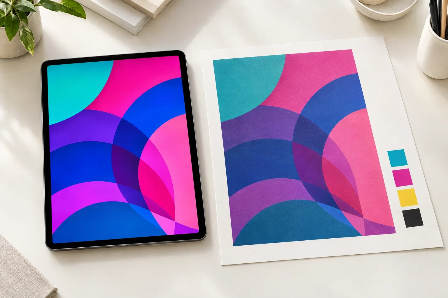
Some colors visible on a modern screen fall outside the range that can be reproduced by a particular CMYK printing process.
When an RGB color falls outside the available printing gamut, color conversion software must approximate it using colors that the printing process can produce.
That approximation may be slightly darker, less saturated, or different in hue.
Example: A Bright Teal Company Logo
Imagine your company's logo uses a very bright turquoise color.
On your computer screen, that turquoise may appear almost luminous because the display produces colored light.
When the same artwork is converted for a standard CMYK printing process, that particular shade may fall outside the printer's available color range.
The printing system may reproduce it as a slightly softer or less saturated turquoise.
The result can still look attractive and professional, but it may not match the brightness of your screen.
Does CMYK Always Look Less Vibrant Than RGB?
No. Many colors reproduce beautifully through CMYK printing.
Ordinary blues, reds, greens, neutrals, and many other colors can often be reproduced closely enough that the difference is not particularly noticeable.
The biggest challenges usually involve colors that fall outside the specific printing process's gamut.
These may include certain:
- Electric blues and bright turquoise colors
- Highly saturated greens
- Neon pinks and fluorescent colors
- Intense purples and violet shades
- Extremely bright oranges and other vivid colors
Some printing systems use additional inks beyond standard CMYK to reproduce a wider range of colors. Specialty inks and spot colors may also be available for certain decoration methods.
What matters is the color range supported by the actual production process, not simply whether the artwork file was originally RGB or CMYK.
Do Promotional Products Always Use CMYK Printing?
No, and this is an especially important distinction when ordering promotional products.
Promotional products are decorated using many different methods. Some use process printing, some use individual ink colors, and others use thread, engraving, heat transfers, or specialized digital printing systems.
For example, a full color print on a power bank may use a different production process than a full color transfer on a t-shirt.
Even two products described as offering full color printing may have different artwork requirements and color reproduction capabilities.
Screen Printing
Traditional screen printing often uses individual spot color inks rather than CMYK process printing.
If your logo has two solid colors, the decorator may use two separate ink colors to reproduce the design.
This approach can be useful when a company needs consistent solid brand colors, especially when the supplier supports custom ink matching.
Learn more in our guide to screen printing vs. transfers.
Full Color Digital Printing
Many digital printing systems use CMYK or additional process inks to create full color artwork.
Depending on the equipment and workflow, the supplier may accept RGB artwork and convert it during production preparation, or they may request files prepared to particular color specifications.
This is why it is important to follow the requirements for the selected product rather than assuming every full color process needs the same file format.
Full Color Transfers
Full color transfers are commonly used for apparel and bags when artwork includes several colors, gradients, or complex details.
The transfer printing process determines how colors are reproduced, and different transfer systems may have different color capabilities.
Read full color digital vs. full color transfer for more information.
Embroidery
Embroidery does not use RGB or CMYK inks. It uses colored thread.
The decorator selects thread colors that represent the logo as closely as practical from the available thread selection.
An RGB or CMYK value may help communicate the intended color, but the physical thread colors determine the final appearance.
Laser Engraving
Laser engraving generally does not reproduce your RGB or CMYK logo colors.
Instead, the finished mark depends on the material, coating, and engraving process.
A colorful logo may need to be converted into a simplified one-color design for engraving.
Full color does not always mean CMYK
Different promotional product suppliers use different printing equipment and processes. Some full color methods use CMYK, while others use additional inks or specialized systems. The artwork requirements and achievable colors depend on the product and decoration method.
Where Do Pantone Colors Fit In?
Pantone colors are another important part of commercial printing, but Pantone is not simply a third alternative to RGB and CMYK.
The Pantone Matching System provides standardized references for specific colors.
For example, a company may identify an official logo blue using a Pantone number. That gives printers a defined color target instead of relying on how the blue looks on someone's computer screen.
For certain printing methods, a supplier may be able to use a specially mixed ink to match a Pantone reference.
For other methods, the Pantone color may need to be approximated using the available printing process.
Not every product supports custom Pantone matching, and exact color reproduction cannot be guaranteed across every material.
Learn more in our guide to what are Pantone colors?
Why the Same Logo Looks Different on Different Products
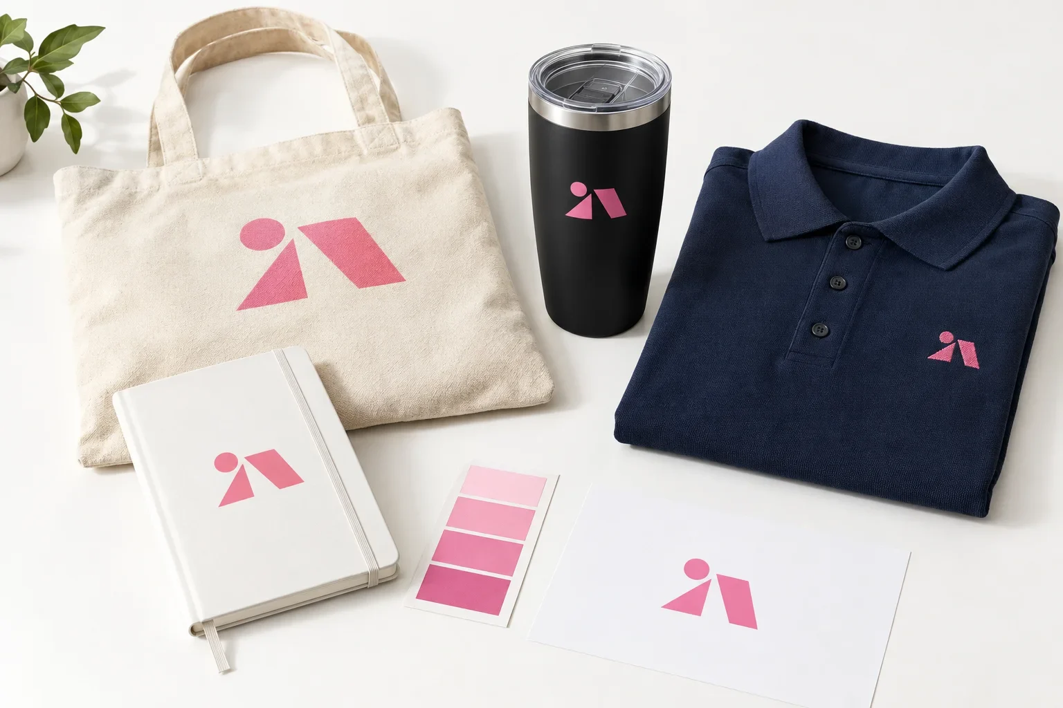
Let's say your company uses a bright pink logo.
You want that logo printed on a white notebook, a natural cotton tote bag, a black tumbler, and a navy polo shirt.
Even if the same color reference is used, the finished appearance may differ.
Consider what happens on each product.
One Logo, Four Different Surfaces
The printing surface and decoration method can influence how the same intended color appears.
White Notebook
A smooth, light surface may allow the printed pink to appear bright and relatively consistent.
Cotton Tote Bag
Fabric texture, ink absorption, and the natural color of the cotton may influence the finished appearance.
Black Tumbler
The dark product color, coating, ink opacity, and available printing method can affect how the pink appears.
Navy Polo Shirt
If the logo is embroidered, the appearance depends on the closest available thread color and its texture.
The differences do not necessarily mean that any of the products were decorated incorrectly.
Physical materials interact with color differently, and different decoration processes have their own limitations.
For a deeper explanation, read why do colors look different on products?
Should I Convert My Logo From RGB to CMYK Before Uploading It?
Not necessarily.
It may sound logical to convert every logo to CMYK before ordering something printed, but that is not always the best approach.
Different suppliers and decoration methods have different requirements. Some may prefer CMYK artwork. Others may work from vector files with specified spot colors. Certain digital processes may accept RGB artwork and handle color conversion within their production workflow.
Converting artwork yourself using the wrong color profile or settings can sometimes create unnecessary color changes.
Instead, the best approach is usually to provide your original, highest-quality artwork and any available brand color information.
Keep your original artwork
Do not replace your original logo file with a converted or flattened version just because you are ordering printed products. If you have an original vector file, send it. If you also have RGB, CMYK, or Pantone specifications, include those when available. The correct production preparation depends on the product and decoration method.
What Is a Color Profile?
When discussing RGB and CMYK, you may also hear the term color profile.
A color profile helps software interpret and convert colors between devices and printing processes.
For example, sRGB and Adobe RGB are two different RGB color spaces. On the printing side, different CMYK profiles describe the color behavior of particular printing conditions.
Two CMYK files with identical numerical ink values may not produce identical colors on different printing systems.
This is one reason professional color conversion is more complicated than simply switching a design program from RGB mode to CMYK mode.
Fortunately, most promotional product customers do not need to manage color profiles themselves. The important thing is to provide good original artwork and follow any specific production instructions.
Can RGB Colors Be Printed Exactly?
Some RGB colors can be reproduced very closely through printing, but others cannot be matched exactly by a particular process.
The result depends on the color itself, the printing equipment, available inks, product material, and other production variables.
If your logo contains highly saturated colors, fluorescent colors, or unusual shades, it is especially helpful to provide official brand color references.
When exact brand color reproduction is critical, ask whether the selected product supports custom ink matching, specialty printing, or a physical sample approval process.
For more information, read can you match my brand colors?
Will My Digital Proof Show the Exact Printed Colors?
A digital proof is an important part of the promotional product ordering process.
It helps you review your logo's placement, size, layout, spelling, general appearance, and stated color specifications before production.
However, a digital proof is displayed on a screen using RGB light.
Because screens vary, the colors displayed in a digital proof may not match the final printed colors exactly.
Even a properly prepared digital proof cannot fully represent how ink will appear on textured fabric, coated metal, plastic, paper, or other physical materials.
That is why it is important to distinguish between approving the artwork and expecting an exact physical color match.
What a digital proof is best for
Use your proof to confirm the correct logo, size, placement, layout, spelling, and listed color specifications. Do not rely on the color displayed on your monitor as a guarantee of the final printed shade.
Read our guide to what is a print proof? for more information about artwork approval.
How to Get More Consistent Colors on Promotional Products
Although some variation is unavoidable, there are several ways to improve color consistency when ordering promotional products.
A Better Approach to Brand Color Consistency
Start with accurate artwork and a clear understanding of the available decoration options.
For products where matching a particular brand color is especially important, it may also be helpful to ask whether a physical sample or printed color reference is available.
Some suppliers offer additional color matching options, while others are limited to standard imprint colors or their normal full color process.
Common RGB and CMYK Mistakes
Most color problems come from assuming that digital artwork and physical printing will always look identical.
Here are some common mistakes to avoid:
- Assuming colors displayed on a computer monitor will print exactly the same way.
- Converting every artwork file to CMYK without checking the supplier's requirements.
- Expecting fluorescent or highly saturated RGB colors to reproduce perfectly through standard CMYK printing.
- Using screenshots as color references instead of official brand color specifications.
- Assuming every full color promotional product uses the same printing process.
- Expecting embroidered thread to match printed ink perfectly.
- Assuming a Pantone reference guarantees an exact match on every material.
- Approving a digital proof based only on how the colors look on a particular screen.
- Ignoring the effect of product color, texture, coating, and material.
For additional artwork preparation advice, read common artwork mistakes.
Frequently Asked Questions About RGB and CMYK
Is RGB or CMYK better for printing?
CMYK is commonly used for process printing, but the best artwork color mode depends on the selected printing method. Some promotional product suppliers accept RGB artwork and perform the necessary conversion during production preparation. Others require specific CMYK or spot color files.
Why is my printed logo darker than it looks on my computer?
Screens create colors using emitted light, while printed products reflect light. Differences in color gamut, screen settings, inks, product material, and lighting can all contribute to a darker or less saturated printed appearance.
Can CMYK reproduce neon colors?
Standard CMYK printing generally cannot reproduce the full intensity of true fluorescent or neon colors. Specialty inks or expanded-gamut printing may offer additional options, depending on the product and supplier.
Does a PNG file use RGB or CMYK?
PNG files are generally used with RGB or grayscale color data. A PNG may contain a transparent background, but that does not make it vector artwork or guarantee it is suitable for printing.
Does a PDF automatically use CMYK?
No. A PDF can contain RGB, CMYK, spot colors, vector artwork, raster images, or combinations of these. The PDF format alone does not determine whether the artwork is ready for production.
Do I need to know RGB and CMYK values to order promotional products?
No. Most customers do not need to know the technical color values of their artwork. Providing the best available logo file and any official brand color information is usually a good starting point.
Artwork Color Checklist Before Ordering
Before submitting artwork for custom promotional products, these simple checks can help reduce unexpected color differences.
- Send your original logo files whenever possible.
- Include vector artwork such as AI, EPS, SVG, or vector PDF files if available.
- Provide Pantone colors or brand guidelines when color consistency matters.
- Do not assume RGB artwork must always be converted to CMYK before uploading.
- Remember that different products may use different printing processes.
- Consider how the product's material and background color may affect the imprint.
- Ask about color matching options when an exact brand color is especially important.
- Review the proof for correct artwork, placement, size, and color specifications.
- Request information about physical samples or color approval options when needed and available.
For more preparation tips, visit our artwork checklist before ordering.
The Bottom Line
RGB and CMYK are two different ways of creating and reproducing color. RGB uses red, green, and blue light to display colors on digital screens. CMYK uses cyan, magenta, yellow, and black inks to reproduce colors through a common commercial printing process.
Because the two systems have different color capabilities, some bright screen colors may not reproduce exactly when printed.
However, promotional products use many decoration methods beyond standard CMYK printing. Spot color inks, full color digital printing, transfers, embroidery, and engraving all have different color considerations.
The best approach is to provide clean original artwork, include any available brand color specifications, and make sure the selected decoration method is appropriate for your logo and product.
What you see on screen isn't always what prints
RGB and CMYK reproduce colors differently, and product materials can influence the final result even further.
You don't have to manage color conversions yourself. Send the best artwork you have, and Purple Pie Promos can help review the available printing and color options before production.

Have questions about your logo colors?
Purple Pie Promos can help review your artwork, brand color requirements, product selection, and available decoration methods. Whether your logo uses RGB, CMYK, or Pantone colors, we can help you understand the options before your order moves into production.
Request Artwork & Color Help