

Quick Answer
Logo colors can look different on promotional products because materials, printing methods, surface finishes, product colors, and lighting affect how colors appear. Ink printed on cotton may look different from ink printed on plastic or coated metal. Embroidery uses thread instead of ink, while engraving often reveals or changes the product's surface rather than applying color. Even when the same Pantone color is specified, the finished appearance may vary between products.
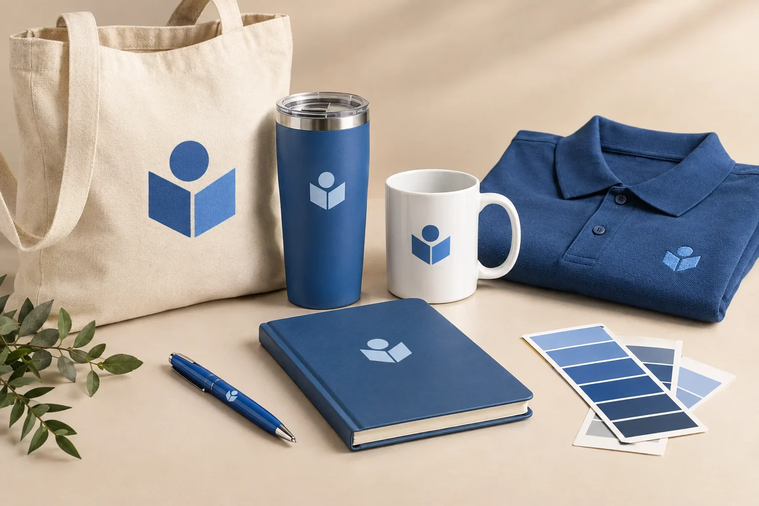
Let's say your company uses a particular shade of blue.
You order custom pens, tote bags, notebooks, tumblers, and embroidered polo shirts for your employees. Everything features the same logo, and you've provided the correct brand color specifications.
When the products arrive, you arrange them together.
The blue on the pens looks bright. The blue on the tote bags seems a little softer. The embroidered blue has a slight sheen, and the logo on the metal tumblers looks different again.
Why doesn't everything match perfectly?
Because printing isn't simply placing a digital color onto a physical object. Every material interacts with ink, thread, light, and decoration differently.
Understanding those differences can help you know what to expect, recognize normal color variation, and identify situations where additional color matching may be necessary.
Why the Same Color Doesn't Always Look the Same
Color is affected by more than the ink or thread used to create it.
The material underneath the decoration, the texture of the surface, the finish of the product, and the surrounding lighting can all influence how a color appears to your eyes.
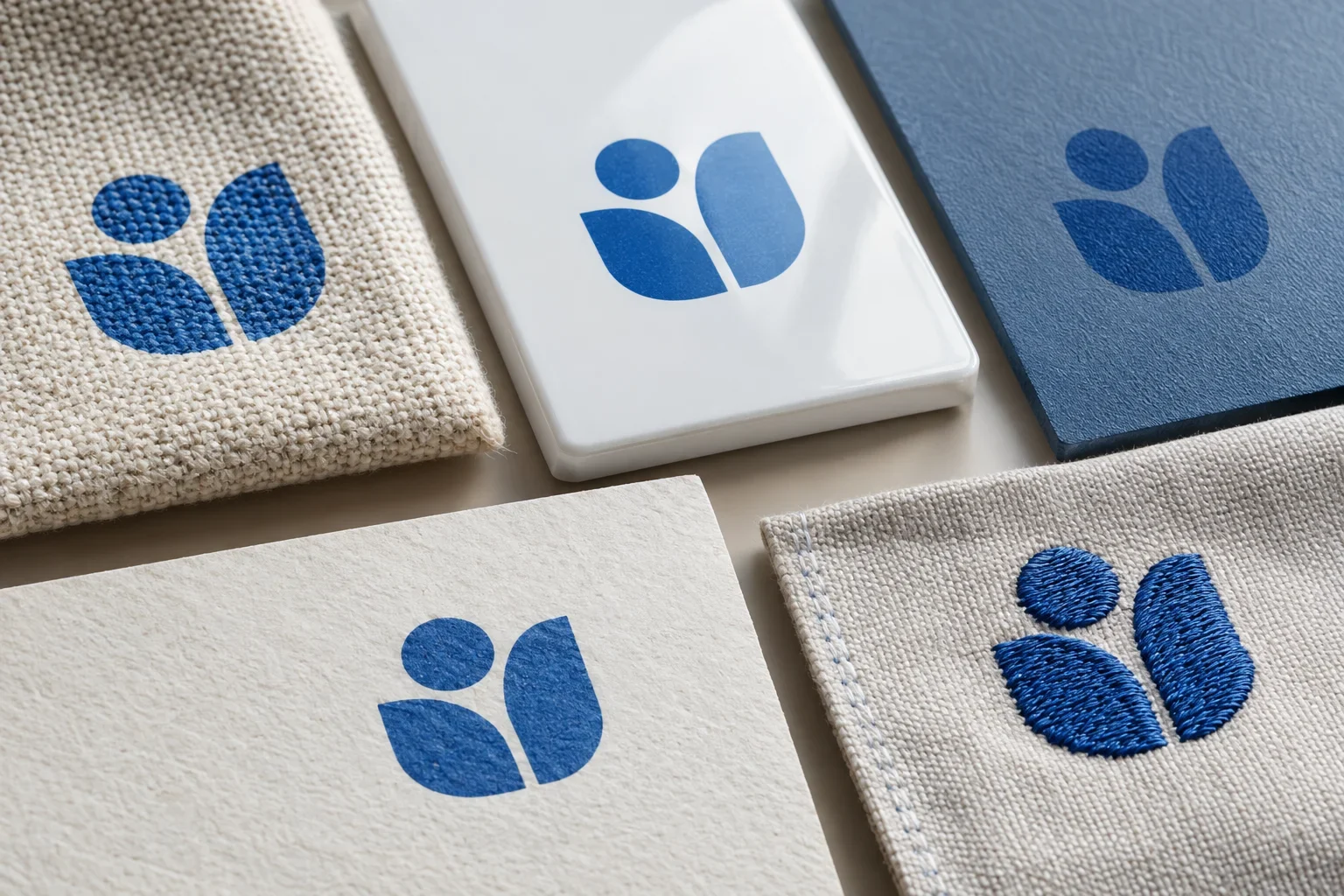
For example, imagine applying the same intended blue to a smooth white plastic surface and a natural cotton fabric.
The plastic surface is relatively smooth and may reflect light more evenly. The cotton has visible fibers, texture, and an underlying fabric color that can influence the appearance of the printed ink.
Even when the decoration is carefully prepared, those differences can change how the blue looks.
Now add embroidery thread, powder-coated metal, glossy ceramic, and textured notebook covers to the mix. Each introduces additional variables.
Color isn't just about the ink
Two products can use the same intended brand color and still look different because of how the materials reflect light, absorb ink, and interact with their decoration methods.
How Different Materials Affect Printed Colors
One of the biggest reasons colors vary between promotional products is the material being decorated.
Different materials have different textures, absorbency, coatings, and surface characteristics. These factors can affect how ink is applied and how the finished color appears.
Cotton and Canvas
Cotton and canvas have woven surfaces made from individual fibers.
When a logo is printed on fabric, the weave, fabric color, ink type, and application process can influence its appearance.
A bright logo printed on a white cotton tote bag may appear different from the same logo printed on a natural beige tote.
The natural fabric color can affect the perceived brightness or hue of the printed design, particularly when the ink is not fully opaque.
Polyester and Performance Fabrics
Polyester and other synthetic fabrics can behave differently from cotton during printing.
Some decoration methods use specialized inks, transfers, or sublimation processes designed for compatible fabrics.
The fabric's texture, dye, finish, and printing process can influence the final color.
Some polyester fabrics may also present dye migration challenges with certain decoration processes, potentially affecting the appearance of printed colors if the appropriate materials and procedures are not used.
Plastic
Plastic promotional products often have relatively smooth surfaces, but different plastics and finishes can produce different results.
A glossy plastic pen may reflect light differently from a matte plastic power bank.
Some plastics are opaque, while others are translucent or transparent. The material's color and finish can influence how a printed logo appears.
Stainless Steel and Coated Metal
Stainless steel drinkware and other metal products may have glossy, matte, textured, or powder-coated finishes.
These finishes can change how light reflects from the product and the printed artwork.
The underlying coating color can also influence the appearance of the imprint, depending on the ink and decoration process.
Laser engraving adds another consideration because it often changes or removes the surface coating rather than applying colored ink.
Paper and Notebook Covers
Paper products can vary from smooth coated surfaces to textured, absorbent, uncoated materials.
Ink may appear brighter on some coated surfaces and softer on certain uncoated materials.
Notebook covers made from leatherette, fabric, paperboard, or other materials may also use different decoration methods, further affecting the finished appearance.
Ceramic and Glass
Ceramic mugs and glass drinkware can have smooth, glossy, or specialty-coated surfaces.
The decoration process and coating can affect the final color, and reflections from the surface may change how the logo appears under different lighting.
Wood and Natural Materials
Wood, bamboo, cork, and other natural materials have unique grain patterns, colors, and textures.
Those natural variations can affect the appearance of printing and engraving.
On engraved wood, the resulting mark may vary depending on the wood species, grain, finish, and engraving process.
Even two pieces of the same natural material may not produce identical-looking results.
Why Product Color Matters
The color of the promotional product itself can have a major influence on how a printed logo looks.
Imagine printing a bright yellow logo on three different tote bags:
- A white cotton tote bag
- A natural beige cotton tote bag
- A black cotton tote bag
The same yellow may not appear identical on all three.
On white fabric, the yellow has a light background. On natural fabric, the underlying beige tone may influence the result. On black fabric, the printer may need to use an opaque ink system or an underbase to help the yellow maintain its intended appearance.
The exact process depends on the product and decoration method.
Printing on White Products
White and other light-colored products often provide a neutral background for printed artwork.
This can make certain colors easier to reproduce, although the material and printing process still matter.
Printing on Dark Products
Dark-colored products can introduce additional challenges, especially when printing bright or light-colored artwork.
Depending on the decoration method, the printer may use opaque ink, a white underbase, or another production technique to improve the appearance of the design.
Not every method uses the same approach, and not every product supports every option.
Printing on Colored Products
A logo printed on a red, green, blue, or other colored product may appear different from the same logo printed on a white surface.
Ink opacity, product color, and the available printing method determine how much influence the background has.
Why Background Color Changes the Result
The product's color can influence the appearance of the printed design.
Light Product Colors
- Often provide a relatively neutral background
- Can help colorful artwork stand out
- May require fewer opacity adjustments for certain methods
- Still affected by the material and surface finish
Dark Product Colors
- Can influence the appearance of less opaque inks
- May require specialized ink or underbase preparation
- Can create strong contrast with light-colored logos
- Available printing options depend on the product
Dark products are not necessarily harder to decorate in every situation. They simply require the appropriate decoration process for the artwork and material.
Why Matte and Glossy Finishes Look Different
Surface finish is another factor that affects how we perceive color.
A glossy surface reflects light differently from a matte surface.
Glossy finishes can create stronger reflections and highlights, while matte finishes generally scatter light more diffusely.
This can make the same intended color appear brighter, deeper, softer, or more reflective depending on the viewing angle and lighting.
Consider two stainless steel tumblers offered in the same general shade of blue.
One has a glossy finish, while the other has a matte powder-coated finish.
Even before adding a logo, the two products may appear slightly different because their surfaces interact with light differently.
Once decoration is applied, the surface finish can influence the appearance of the printed or engraved design as well.
Color and finish are connected
A color that looks bright and reflective on a glossy surface may appear softer on a matte surface. This doesn't necessarily mean the underlying color specification is wrong. The finish changes how light reaches your eyes.
Why the Printing Method Changes the Color
Even when two promotional products are made from similar materials, different decoration methods can produce different-looking results.
That's because printing methods don't all create colors in the same way.
Spot Color Printing
Traditional screen printing and pad printing often use individual ink colors.
When custom Pantone matching is available, a printer may be able to mix ink to target a particular brand color.
This can be useful for solid logos that require consistent colors.
However, the final appearance still depends on the ink system, material, surface color, and production process.
Full Color Digital Printing
Digital printing often creates colors by combining several available inks.
Depending on the equipment, the process may use CMYK or an expanded selection of inks.
Some colors reproduce very closely, while others fall outside the printer's available color range.
As a result, a specific brand color may look slightly different when reproduced digitally compared with a specially mixed spot color ink.
Full Color Transfers
Transfers are created separately and applied to a product using the appropriate application process.
The printed transfer, transfer material, garment, and application conditions can all influence the finished appearance.
A colorful design applied as a transfer may look different from the same design printed directly onto fabric.
Embroidery
Embroidery uses colored thread rather than ink.
Threads have their own texture, sheen, and available color range.
Even when the closest available thread color is selected, the finished appearance may differ from a printed version of the same logo.
Laser Engraving
Laser engraving generally doesn't reproduce a logo's original printed colors.
Instead, the laser marks, changes, or removes material from the product surface.
On a powder-coated tumbler, engraving may reveal the underlying metal or another layer beneath the coating.
On wood, engraving may darken the surface. Other materials may produce different results.
For this reason, engraving is usually evaluated based on the appearance of the mark rather than matching a particular Pantone ink color.
Debossing and Embossing
Debossing and embossing create recessed or raised impressions in a material.
When no additional color is applied, the appearance comes primarily from the product's material, texture, and the way light creates highlights and shadows around the design.
For a broader overview, read which decoration method should I choose?
Why Embroidery Colors Can Look Different From Printed Logos
Embroidery deserves special attention because it's one of the most common situations where customers notice color differences.
Imagine a company orders screen printed t-shirts and embroidered polos using the same logo.
The printed logo uses ink, while the embroidered logo uses thread.
Even if the intended colors are identical, thread reflects light differently from ink.
Individual stitches can catch the light, and the direction of the stitching can affect how bright or dark the embroidered area appears.
Thread manufacturers also have a finite selection of colors, so the closest available thread may not exactly match the requested Pantone reference.
This doesn't mean embroidery is less attractive. In many cases, the dimensional texture of embroidery is part of what makes it desirable.
It simply creates a different visual result from printing.
Printed ink and embroidery thread aren't identical materials
If you're ordering a coordinated collection of printed and embroidered apparel, some color variation may be expected. Providing brand color information helps establish the intended color, but the available thread and ink systems determine the final appearance.
How Lighting Changes the Way Colors Look
Have you ever looked at a shirt in a store, brought it outside, and noticed that the color looked different in sunlight?
The same thing can happen with promotional products.
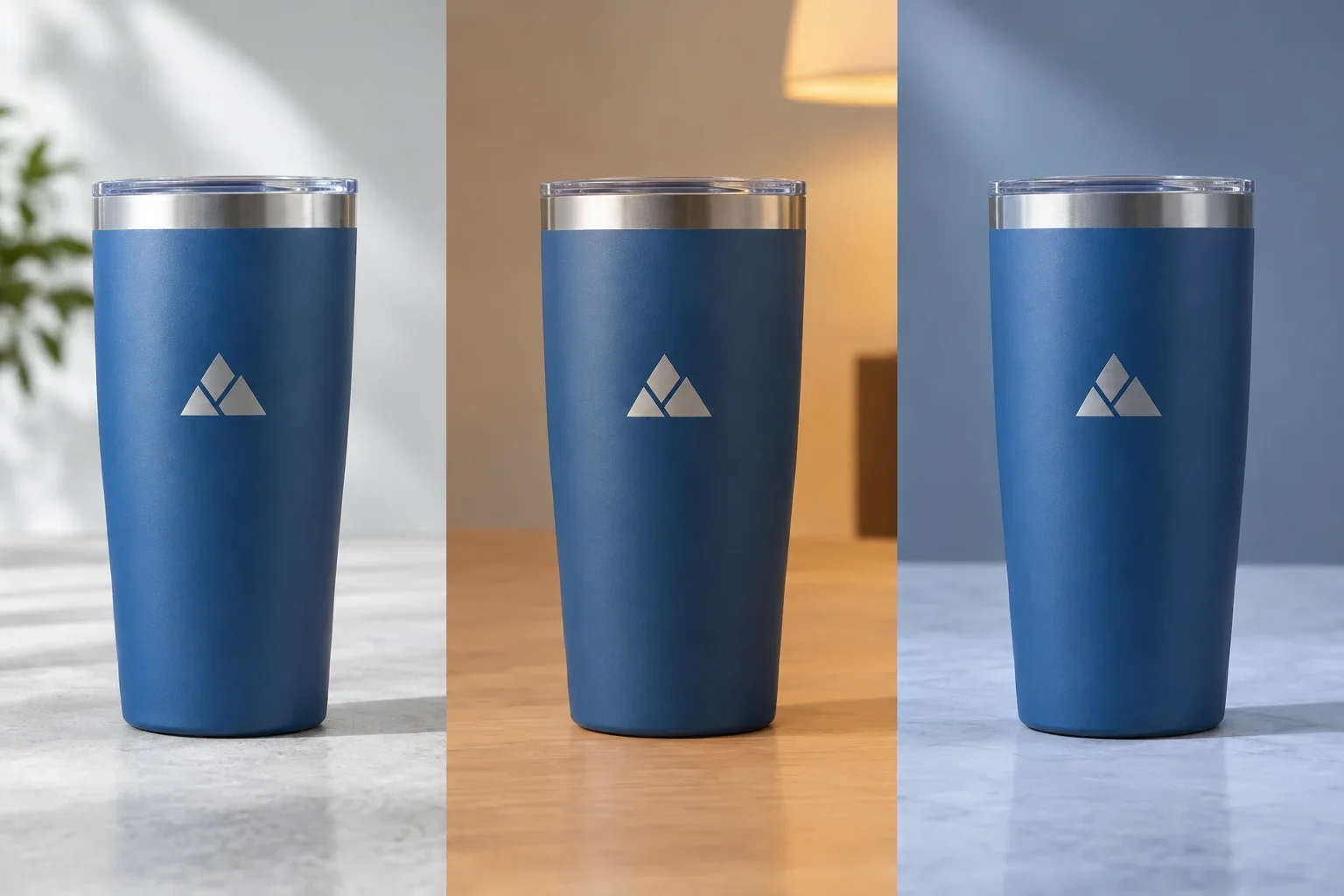
Colors may appear different under natural daylight, warm indoor lighting, fluorescent office lights, or other lighting conditions.
Different light sources contain different combinations of wavelengths, which affect how materials and printed colors appear.
A logo that looks slightly purple under one light source may appear more blue under another.
Sometimes two colors that look nearly identical under one light source can become noticeably different under another. This phenomenon is called metamerism.
You don't need to remember that term, but the concept is useful when evaluating color matches.
Daylight
Natural daylight is often useful for evaluating physical colors, although its appearance also changes depending on weather, time of day, and surroundings.
Warm Indoor Lighting
Warm lighting can make some colors appear more yellow, orange, or muted.
Cool Office Lighting
Cooler lighting may emphasize different tones, potentially making some colors appear bluer or less warm.
Computer and Phone Screens
Screens create color using light rather than reflecting light from a physical surface.
Brightness, calibration, display technology, and color settings can all affect how a digital image appears.
This is why a color displayed on your phone is not necessarily an accurate reference for how printed ink will appear on a promotional product.
Why Colors Can Vary Between Production Runs
Sometimes customers reorder the same promotional product months or years later and notice a slight difference in the finished color.
This can happen for several reasons.
Materials, coatings, inks, thread supplies, printing equipment, and production conditions may differ between manufacturing batches.
For example, a manufacturer may produce a new batch of tumblers using a slightly different coating lot. A printing supplier may use a different production setup or ink batch.
Even when the same product and color specifications are used, some manufacturing variation may occur.
For projects where consistency between repeat orders is particularly important, it can be helpful to retain previous order specifications and discuss any matching requirements before placing a reorder.
A previous physical sample may also be useful as a reference when the supplier can accommodate that type of comparison.
Is Some Color Variation Normal, or Is It a Printing Problem?
Not every color difference means something went wrong.
Subtle changes caused by different materials, surface finishes, and printing methods can be expected.
However, that doesn't mean every color difference should automatically be accepted.
There is an important distinction between normal production variation and a result that may not match the approved specifications.
Normal Variation vs. Something Worth Checking
Some differences are inherent to the product or method. Others may deserve closer review.
Differences That May Be Expected
- Ink appearing slightly different on cotton and plastic
- Embroidery thread having a different sheen from printed ink
- Glossy and matte surfaces reflecting light differently
- Natural material grain affecting appearance
- Small variations within an applicable production tolerance
Differences Worth Reviewing
- An imprint using a different color than the approved specification
- A logo appearing significantly different from an agreed color target
- Unexpected color contamination or visible printing defects
- Inconsistent decoration within the same order beyond applicable tolerances
- A color or decoration method that differs from what was approved
If a finished product appears substantially different from the approved artwork or applicable production specifications, it's reasonable to ask for a review.
Whether the difference falls outside acceptable production tolerances depends on the product, supplier, and circumstances.
When comparing colors, try to evaluate the products under similar lighting conditions rather than comparing one item under indoor lighting with another photographed outdoors.
Does Providing a Pantone Color Prevent These Differences?
Providing a Pantone color is helpful, but it doesn't eliminate every source of variation.
The Pantone Matching System provides standardized color references that designers, printers, and manufacturers can use to communicate intended colors.
For some decoration methods, a supplier may be able to mix ink to target a particular Pantone shade.
For other methods, the closest available standard ink, digital reproduction, or embroidery thread may be used.
Even when a Pantone-matched ink is available, the finished appearance can still be influenced by the product material, surface color, finish, and lighting.
Think of the Pantone number as a defined color target rather than a guarantee that every physical product will look identical.
For more information, read what are Pantone colors? and can you match my brand colors?
Why Digital Proofs Don't Show Exact Finished Colors
When reviewing an artwork proof, you may notice that the logo color on your screen doesn't look quite like your company's official brand color.
That doesn't necessarily mean the final printed product will have the same difference.
Digital proofs are displayed using computer or phone screens, which reproduce colors using light.
Physical products use ink, thread, engraving, or other decoration methods.
Those processes behave differently, and the digital preview may not accurately represent every aspect of the final decoration.
A digital proof is primarily useful for confirming:
- The correct logo and artwork version
- The intended imprint placement
- The stated imprint dimensions
- Spelling and other artwork details
- Listed ink, Pantone, or thread color specifications when applicable
- The selected decoration method and other relevant production details
If exact color appearance is critical, ask whether physical samples or additional color approval options are available for the selected product.
Read what is a print proof? for more information about artwork approval.
How to Get More Consistent Colors Across Promotional Products
While perfect color consistency across every material may not be realistic, there are practical steps that can improve the results.
Start With Good Original Artwork
Original vector logo files provide a clean starting point for many decoration methods.
They also make it easier to identify and prepare separate logo colors when necessary.
Provide Official Brand Color References
If your company has Pantone specifications or formal brand guidelines, include them with your artwork.
These references give the decorator a clearer target than a screenshot or a verbal color description.
Consider the Product Material
If maintaining a particular brand color is your highest priority, consider how the selected material and surface finish may affect reproduction.
A product with a smooth, light-colored printing surface may be a more suitable choice for certain artwork than a textured or dark-colored alternative.
Review the Decoration Method
Some methods offer more direct control over solid brand colors than others.
For example, custom spot color ink matching may be helpful for a simple logo when available, while full color digital printing may be better for detailed artwork with gradients.
The best option depends on the product and the design.
Ask About Color Matching Options
Some suppliers support custom Pantone matching, while others offer standard imprint colors.
If the exact shade is especially important, review the available options before placing the order.
Consider Physical Samples for Critical Projects
A physical sample can help evaluate the appearance of the actual decoration on the product material.
However, pre-production samples may involve additional charges, minimum quantities, or production time, and they're not available for every item.
A Practical Approach to Color Consistency
Good preparation helps reduce surprises before production begins.
What If I'm Ordering Several Different Products Together?
Coordinated promotional product collections are popular for employee welcome kits, corporate gifts, conferences, trade shows, and company events.
You might order a matching collection of drinkware, bags, notebooks, apparel, and writing instruments.
When selecting several different products, it's helpful to consider the overall visual appearance of the collection rather than expecting every printed surface to be completely identical.
For example, you may choose products in complementary colors and use the same approved logo version throughout the collection.
Sometimes a consistent one-color logo works well across several items. Other times, using approved light and dark versions of the logo creates a more cohesive appearance on different product colors.
If precise matching is especially important, it may be worth comparing the available decoration methods before finalizing the collection.
Consistency doesn't always mean identical
A coordinated collection can look professional and consistent even when the logo appears slightly different on fabric, metal, plastic, and paper. Good product selection, approved logo versions, and thoughtful decoration choices often matter more than expecting every material to reproduce color in exactly the same way.
Frequently Asked Questions About Color Differences
Why does my logo look darker on a tumbler than on a pen?
The tumbler's coating, surface color, finish, and decoration method may affect the appearance of the logo. The pen may use a different ink system or have a smoother, lighter surface. Lighting can also influence the comparison.
Why does my printed logo look different on cotton and polyester?
Cotton and polyester have different fiber properties and may use different printing methods. Fabric texture, dyes, inks, and application processes can all affect color reproduction.
Why doesn't my embroidered logo match my printed logo?
Embroidery uses thread rather than ink. Thread color availability, texture, sheen, and stitch direction can influence the appearance. The closest available thread may not be an exact match to the printed ink color.
Can the same Pantone color look different on different products?
Yes. Pantone provides a standardized color reference, but different materials and decoration processes can affect how closely that color is reproduced and how it appears.
Why does my logo look different under office lighting?
Different light sources contain different combinations of wavelengths. This can affect how printed inks, fabric dyes, and other materials appear to your eyes.
Why does my logo look different on a black product?
The dark background may influence the appearance of the ink, depending on its opacity and the printing process. Some methods use opaque inks, white underbases, or other techniques to help colors reproduce properly on dark products.
Will full color printing make every product match exactly?
No. Full color printing can reproduce a wide range of colors, but different equipment, inks, materials, and printing conditions can still produce variations.
Can colors vary when I reorder the same promotional product?
Some variation can occur between production runs due to material batches, coatings, inks, or other manufacturing conditions. If consistency with a previous order is critical, mention that before placing the reorder.
What should I do if the colors on my order look wrong?
Compare the finished products with the approved color specifications and any applicable physical references under consistent lighting. If the difference appears significant or inconsistent with what was approved, contact Purple Pie Promos so the order details and supplier specifications can be reviewed.
Color Consistency Checklist Before Ordering
Before ordering promotional products where brand color consistency matters, review these details.
- Send your original logo artwork whenever possible.
- Provide Pantone numbers or official brand guidelines if available.
- Consider how the product's material and texture may affect the printed color.
- Remember that dark and light product colors can influence imprint appearance.
- Review whether the product has a glossy, matte, textured, or specialty finish.
- Understand whether the decoration uses spot color ink, digital printing, transfers, embroidery, or engraving.
- Check whether custom color matching is available if precise branding is important.
- Remember that embroidery thread may look different from printed ink.
- Evaluate physical colors under consistent lighting when making comparisons.
- Ask about physical samples or additional color approval options for critical projects.
- Review the artwork proof and applicable color specifications before approval.
- For repeat orders, communicate any requirements for consistency with previous production.
For more preparation advice, visit our artwork checklist before ordering.
The Bottom Line
Colors can look different on promotional products because every material, finish, and decoration process interacts with color differently.
Fabric texture, ink absorption, product color, surface coatings, embroidery thread, printing equipment, and lighting can all affect the final appearance.
Even when the same Pantone reference is used, the finished color may not look identical on a pen, tote bag, tumbler, notebook, and embroidered shirt.
Some variation is normal, but significant differences from approved specifications may deserve review.
The best way to improve consistency is to start with good artwork, provide official brand color references, choose appropriate products and decoration methods, and communicate any strict color requirements before production.
Same logo, different materials, different results
Color consistency is about more than choosing the right ink. The product material, surface finish, decoration method, and lighting all influence how your logo looks.
Purple Pie Promos can help review your artwork, brand colors, and available decoration options so you understand what to expect before your order moves into production.

Want your branding to look consistent across different products?
Purple Pie Promos can help review your artwork, brand color specifications, product materials, and available decoration methods. Whether you're ordering a single promotional item or a coordinated collection, we'll help you understand the color options and limitations before production.
Request Artwork & Color Help