

Quick Answer
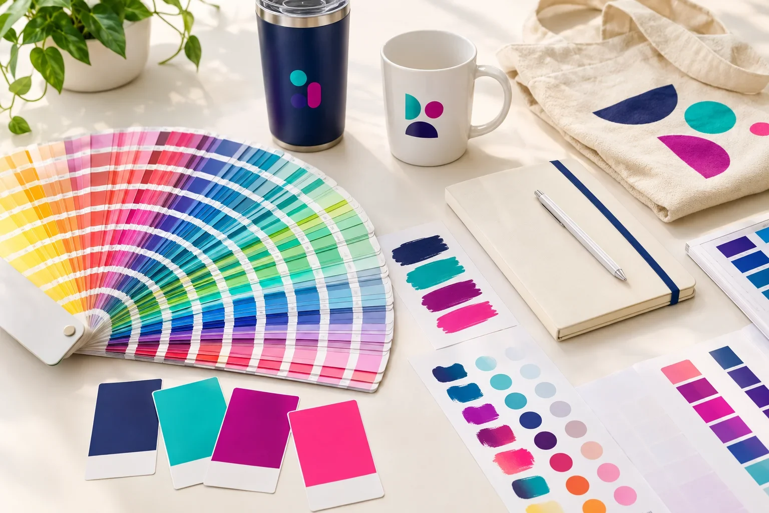
Pantone colors are standardized color references used by designers, printers, and manufacturers to communicate specific colors. Each color has an identifying name or number, allowing different businesses to reference the same intended color. Pantone's PMS system is especially common in commercial printing. However, the final appearance of a Pantone color can vary depending on the printing method, product material, surface finish, and available inks.
Imagine your company has a very specific shade of blue. It is not quite royal blue, not quite navy, and definitely not the bright blue your printer seems determined to use.
Now imagine ordering 500 custom pens, 200 tote bags, and 100 stainless steel tumblers. You want the same company blue on everything.
Without a shared color reference, one printer might choose a slightly purple-blue ink, another might use a darker blue, and a third might select the closest standard color available.
That is the problem Pantone colors help solve.
Instead of asking for "our usual blue," you can provide a specific color reference that helps everyone understand the intended result.
But there is an important distinction: specifying the same Pantone color does not guarantee that every product will look exactly the same.
Understanding why can help you make better decisions when ordering custom promotional products.
What Is the Pantone Matching System?
The Pantone Matching System, commonly called PMS, is a standardized color identification system widely used in graphic design and printing.
Rather than describing a color with words like dark red, forest green, or bright orange, designers can identify a specific color using a Pantone reference.
For example, a company's brand guidelines might specify PANTONE 186 C for a particular shade of red.
That reference gives a printer a much more specific starting point than simply requesting red ink.
Pantone publishes physical color guides containing printed swatches. These allow designers and printers to compare actual colors rather than relying entirely on how a color appears on a computer screen.
Think of Pantone as a shared color language
Instead of trying to describe a color over the phone or through an email, a Pantone reference gives designers and printers a common target. It helps communicate the intended color more precisely, even when the final production process cannot reproduce it exactly.
What Does a Pantone Number Mean?
A Pantone number identifies a particular color within a Pantone color system.
You may see references such as PANTONE 186 C, PANTONE 286 C, or PANTONE 347 C in company brand guidelines, design files, or printing instructions.
These are examples of specific colors, not generic names for red, blue, or green.
The letters after a Pantone number can also matter.
Understanding Pantone Color References
A Pantone reference often includes both a color number and an indication of the color guide being used.
PANTONE 186 C
C means coated.
This reference is associated with the appearance of the ink on coated paper, which generally has a smoother, less absorbent surface.
Coated swatches often appear brighter or more saturated than their uncoated counterparts.
PANTONE 186 U
U means uncoated.
This reference is associated with the appearance of the ink on uncoated paper, which absorbs ink differently.
Uncoated swatches may appear softer or less saturated than coated versions.
These suffixes describe the reference guide and printing surface. They do not mean that a promotional product is automatically printed on coated or uncoated paper.
Pantone also has color systems for other applications, including textiles. The appropriate color reference depends on the material and industry.
How Pantone Colors Are Used in Promotional Products
When ordering custom promotional products, you may be asked whether your logo has specific PMS colors.
This is particularly common when companies have established brand guidelines and want their printed logo colors to remain consistent.
For example, you might provide artwork containing a dark blue logo and specify that the blue should match a particular Pantone reference.
Depending on the product and decoration method, the supplier may be able to use a specially mixed ink, select a close standard ink color, or reproduce the color through a full color printing process.
Not every supplier or decoration method offers the same color matching capabilities.
Screen Printing and Pad Printing
Traditional screen printing and pad printing often use individual ink colors. On some products, a specific Pantone color can be matched using specially mixed ink.
However, some products are limited to a supplier's standard imprint color selection. In those cases, the closest available standard color may be the practical option.
Custom color matching may also involve additional setup requirements, fees, or minimum quantities depending on the supplier.
Full Color Digital Printing
Full color digital printing uses combinations of inks to reproduce many colors, including gradients and detailed artwork.
Because these colors are created through a printing process rather than necessarily using a dedicated Pantone-matched ink, the final result may be an approximation of the requested Pantone color.
Some Pantone colors can be reproduced quite closely through digital printing. Others fall outside the color range available to a particular printer or process.
Embroidery
Embroidery uses thread rather than printed ink.
If you provide a Pantone color for an embroidered logo, the decorator may use that reference to select an available thread color that closely resembles it.
Thread manufacturers have their own color selections, and an exact Pantone equivalent may not exist.
Laser Engraving and Debossing
Not all decoration methods apply colored ink.
Laser engraving often reveals or changes the underlying material or coating. Debossing presses a design into a surface without necessarily adding color.
For these methods, the product material and decoration process determine the finished appearance rather than a Pantone ink specification.
If you are unsure which method works best for your logo, read which decoration method should I choose?

Why Doesn't the Same Pantone Color Look Identical on Every Product?
This is one of the most important things to understand about Pantone colors.
A Pantone number identifies a color target. It does not eliminate the physical differences between materials, inks, printing equipment, and decoration methods.
Consider that same company blue from earlier.
Now imagine it being reproduced on four different promotional products.
A White Plastic Pen
The logo may be printed with an opaque ink on a relatively smooth plastic surface. If the supplier supports a Pantone-matched ink, the result may be a close match to the requested color.
A Natural Cotton Tote Bag
Cotton has a woven texture and a more absorbent surface. Depending on the ink and printing process, the blue may appear slightly different from the same color printed on smooth plastic.
A Dark Stainless Steel Tumbler
The tumbler's coating, surface color, and available printing method can influence the final appearance. A blue printed on dark navy or black drinkware may require different ink preparation than the same blue printed on a white surface.
An Embroidered Polo Shirt
Embroidery uses colored thread. The thread may be close to the requested blue, but its texture and reflective properties can make it look different from printed ink.
All four products may be based on the same Pantone reference, yet the finished colors may not appear identical.
The material matters as much as the color reference
Even when a Pantone number is provided, the final appearance can be affected by product color, material texture, surface coating, ink opacity, thread selection, printing equipment, and lighting. This is why exact matches cannot always be guaranteed across different promotional products.
Pantone vs. CMYK vs. RGB: What's the Difference?
These three color systems are commonly mentioned together, but they serve different purposes.
Pantone is a standardized color reference system. RGB describes colors displayed using light, while CMYK describes a common process for reproducing printed colors with ink.
Three Ways to Describe Color
The same brand color may have different specifications depending on where it is being used.
Pantone / PMS
Best understood as a color reference.
Uses standardized color identifiers to communicate specific target colors. Commonly used in brand guidelines and commercial printing.
CMYK
Common for process printing.
Uses cyan, magenta, yellow, and black inks in varying combinations to reproduce a wide range of colors.
RGB
Common for screens.
Uses red, green, and blue light to display colors on computers, phones, tablets, and other digital screens.
For example, a company's bright green logo may look vivid on a computer monitor in RGB. When that color is reproduced using CMYK inks, it may appear slightly less vibrant because the printing process has a different available range of colors.
A Pantone reference can help communicate the intended green, but the available printing process still determines how closely that color can be reproduced.
For a deeper explanation, read RGB vs. CMYK.
Can Every Pantone Color Be Matched Exactly?
No. Not every Pantone color can be reproduced exactly on every product or with every decoration method.
Some colors are easier to reproduce than others. Certain extremely bright, fluorescent, metallic, or highly saturated colors may require specialized inks or processes.
Even common brand colors can appear different when reproduced on fabrics, coated metals, plastics, ceramics, and other materials.
In some cases, a supplier can mix ink to a specific Pantone target. In others, only standard imprint colors or full color reproduction may be available.
That does not mean you should avoid specifying Pantone colors. Providing the reference is still helpful because it gives the decorator a clear target.
Color matching is about controlling the variables
The more information available about your brand color, product, and decoration method, the easier it is to evaluate the closest practical result. A Pantone number helps establish the target, but the production process determines what is achievable.
How Does Pantone Color Matching Work When Ordering?
If your company has established Pantone colors, the process usually begins with providing those references along with your artwork.
The available matching options depend on the specific promotional product and decoration method.
From Brand Color to Finished Product
How your intended color is evaluated before production.
Purple Pie Promos reviews artwork, imprint areas, and decoration options before production. If a specific requested color cannot be reproduced through the available method, we can help explain the options before the order moves forward.
Does Pantone Color Matching Cost Extra?
Sometimes, depending on the supplier and decoration method.
Some products offer a selection of standard imprint colors at no additional color matching charge. If your brand color closely matches one of those standard options, that may be the simplest choice.
Other products may offer custom PMS color matching, which can involve additional ink mixing, setup, minimum quantities, or other charges.
Full color printing may not require a separate specially mixed ink, but that does not mean it can reproduce every Pantone color exactly.
Color matching availability and costs vary by product and supplier, so it is important to review the available options for the specific item you are ordering.
Do I Need to Know My Pantone Colors Before Ordering?
No. Many customers do not have Pantone numbers for their logos, and that is perfectly fine.
Some businesses have formal brand guidelines with approved Pantone, CMYK, RGB, and HEX color values. Others simply have a logo file and know what their company colors are supposed to look like.
If you have Pantone numbers, include them with your artwork. If you do not, send the best logo file you have.
If precise color matching is especially important, mention that when requesting your quote or placing your order so the available options can be reviewed.
Where Can I Find My Company's Pantone Colors?
If your business has professionally developed branding, your Pantone references may already be documented.
Good places to check include:
- Your company's official brand guidelines or style guide
- Original logo design files from your graphic designer
- Marketing department brand asset folders
- Previous commercial printing specifications
- Packaging or signage production files
- Past promotional product order records
- Your branding agency or original logo designer
If you only have RGB, CMYK, or HEX values, those can also be useful references. However, converting these values to Pantone is not always exact.
A physical Pantone swatch guide can be helpful when identifying or confirming an intended color.
What About Matching the Actual Product Color?
There is another important distinction when ordering promotional products: matching your printed logo color is different from matching the color of the product itself.
For example, you may want a tumbler that is the same blue as your company logo.
But the manufacturer's available tumbler colors may be navy, royal blue, teal, black, white, and red. Even if you know your exact Pantone blue, the product itself may not be manufactured in that shade.
Custom product manufacturing in a specific color is a separate process from selecting a Pantone-matched imprint ink. It may involve different availability, quantities, costs, and production requirements.
For standard promotional products, the practical approach is often to select the closest available product color and then choose an appropriate imprint color.
Product color and imprint color are two separate decisions
A Pantone reference can help specify the color of your printed logo. It does not mean the promotional product itself is available in that exact shade. Product color options are determined by the manufacturer, while imprint color options depend on the decoration method.
Can a Digital Proof Show My Exact Pantone Color?
A digital proof is useful for checking the artwork, layout, imprint placement, size, and stated color specifications.
However, a digital proof is displayed on a screen. Screens use RGB light, and the appearance of a color can vary from one monitor or phone to another.
That means a digital proof generally should not be treated as an exact representation of how a Pantone color will look when printed on a physical promotional product.
If your brand has strict color requirements, ask whether physical samples, printed color references, or other color approval options are available for the product and decoration method.
For more information, read what is a print proof?
Common Questions About Pantone Colors
Is PMS the same as Pantone?
PMS stands for Pantone Matching System. The terms are often used together when referring to standardized spot color references in commercial printing. Pantone also maintains other color systems for different materials and applications.
Can I choose a Pantone color for any promotional product?
You can provide a Pantone reference for review, but not every product supports custom Pantone-matched printing. Some products offer standard imprint colors, while others support custom matching or full color reproduction.
Will my embroidered logo match my printed logo?
It may be close, but an exact match is not guaranteed. Embroidery uses thread, while printing uses ink. The materials and finishes can affect how the colors appear.
Can I just send a picture of the color I want?
A photo or screenshot can help communicate your general preference, but lighting, image processing, and screen differences can affect the color. A Pantone reference or official brand guidelines are more reliable when color accuracy matters.
Can Purple Pie Promos help if I don't know my Pantone colors?
Yes. You can send your logo and any available brand information. We can review the artwork and available decoration options to help determine an appropriate approach for your order. Exact matching capabilities depend on the product and supplier.
Brand Color Checklist Before Ordering
When consistent branding matters, a few simple steps can make the ordering process easier.
- Send your original logo artwork whenever possible.
- Include Pantone color references if your company has them.
- Provide brand guidelines if available.
- Identify which logo colors are especially important to match.
- Remember that standard product colors are separate from imprint ink colors.
- Ask whether custom PMS matching is available for your selected product.
- Review any additional color matching costs or requirements.
- Check the proof for the correct color specifications, logo version, and placement.
- Consider a physical sample or color approval option when precise matching is critical and one is available.
For additional preparation tips, visit our artwork checklist before ordering.
The Bottom Line
Pantone colors provide a standardized way to communicate specific colors to designers, printers, and manufacturers. They are especially helpful for businesses that want their branding to remain consistent across different materials and promotional products.
However, specifying a Pantone color does not guarantee identical results on every product. Printing methods, available inks, thread colors, materials, coatings, product colors, and lighting can all influence the finished appearance.
The best approach is to provide your official brand color references when available and understand what matching options are supported by the product and decoration method.
Consistent branding starts with clear color references
Pantone colors help everyone work toward the same intended color, but the material and printing process determine how closely that color can be reproduced.
Have a specific brand color in mind? Send us your artwork and color information so we can help review the available options before production.
Need help matching your brand colors?
Purple Pie Promos can help review your logo colors, product selection, and available decoration methods. Whether you have specific Pantone numbers or just your original artwork, we can help you understand the color options before your order moves into production.
Request Color Matching Help