

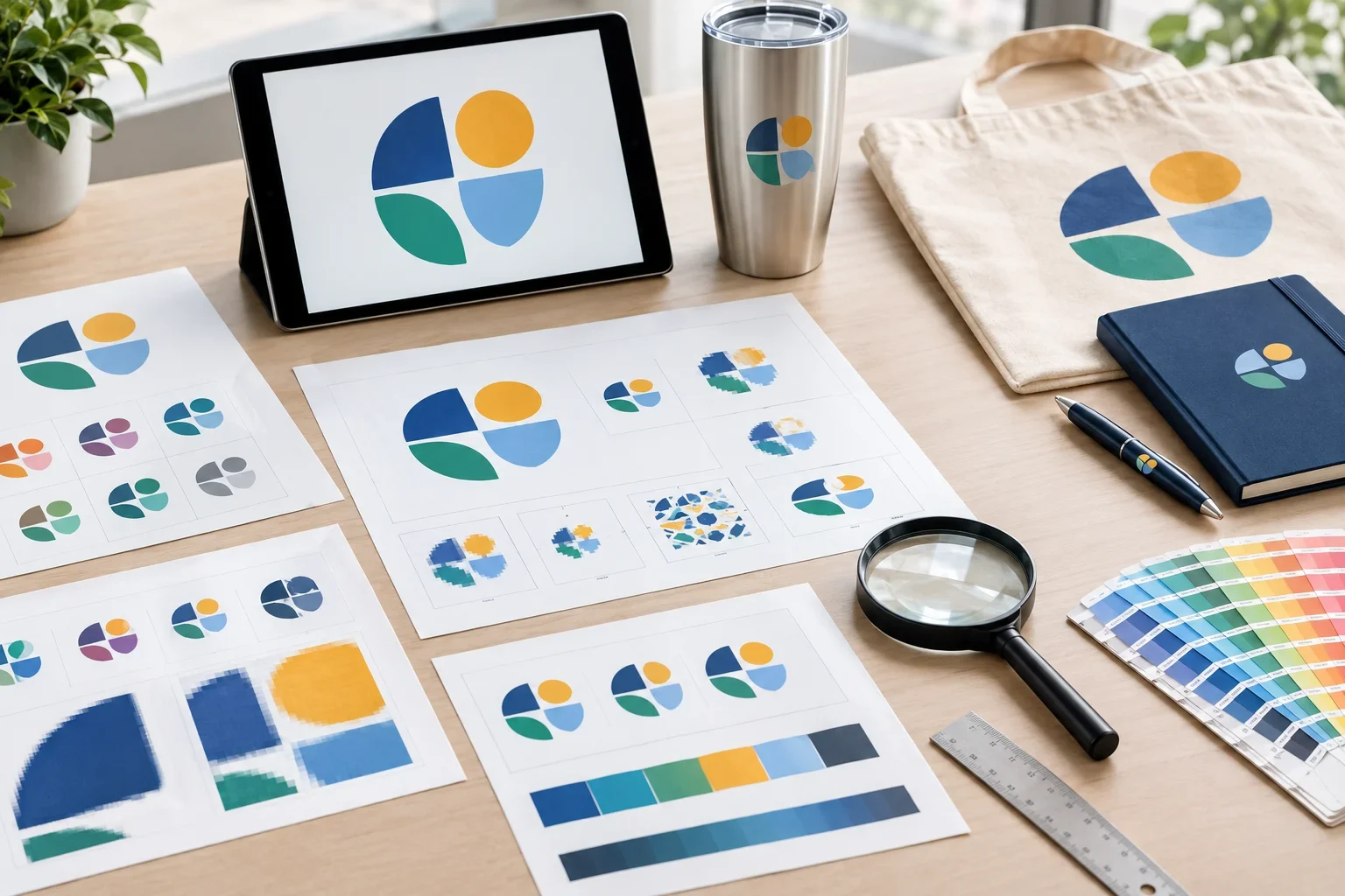
Quick Answer
The most common promotional product artwork mistakes include uploading low-resolution logos, using screenshots instead of original files, assuming a PDF is automatically vector artwork, submitting designs with tiny details, choosing colors that cannot be reproduced by the selected method, and approving proofs without checking every detail. Many of these problems can be avoided by sending the best artwork available and reviewing the imprint specifications before production.
You've picked out the perfect promotional products. The colors look great, the quantity is right, and you're excited to see your logo on everything.
Then you get a message asking for better artwork.
Maybe your logo is too blurry. Maybe the file isn't vector. Maybe the tiny tagline won't print clearly on the pen you selected.
These situations are incredibly common, even for businesses that have been ordering promotional products for years.
The reason is simple: artwork that looks great on a computer screen isn't necessarily prepared for printing, embroidery, engraving, or other decoration methods.
The good news is that many artwork problems can be identified and addressed before production. Understanding the most common mistakes can help prevent delays, unexpected changes, and disappointing results.
You don't need perfect artwork to get started
Purple Pie Promos reviews your artwork, product, imprint area, and decoration method before production. If a better file or adjustment is needed, we'll help guide you through the available options. The important thing is to send the best artwork you have rather than guessing which file will work.
Artwork File Mistakes
Some of the most common problems happen before anyone even begins preparing your logo for printing.
These mistakes usually involve the file itself rather than the design.
Mistake #1: Uploading a Screenshot Instead of the Original Logo
It's easy to understand why this happens. Your company logo is visible on your website, so taking a screenshot seems like a convenient way to send it.
Unfortunately, screenshots capture pixels from a screen rather than preserving the original artwork.
The result may be too small, blurry, or compressed for professional printing.
Why it causes problems: Screenshots often lack the resolution and clean edges needed for printing, embroidery, engraving, and other decoration processes.
What to do instead: Look for the original logo file from your designer, marketing department, website developer, or previous printing vendor. Vector files such as AI, EPS, SVG, or vector PDF are usually preferred.
If a screenshot is all you have
Send it anyway. It can still help identify the correct logo. Just understand that a better file or artwork recreation may be needed before production.
Mistake #2: Assuming a PNG or JPG Is Vector Artwork
PNG and JPG files are common image formats, but they are raster images made from pixels.
Even a PNG with a transparent background is still a raster image.
This doesn't mean PNG and JPG files are useless. High-resolution raster artwork can work well for certain full color decoration methods.
However, logos that need to be resized, separated into spot colors, engraved, or prepared for other specialized decoration methods often benefit from vector artwork.
Why it causes problems: Raster images can lose quality when enlarged and may require additional preparation for certain production processes.
What to do instead: Send the original vector file when available. If you only have PNG or JPG artwork, send the highest-resolution version.
Learn more in vector vs. raster images.
Mistake #3: Assuming Every PDF Is Vector Artwork
PDF files are commonly used for professional printing, but not every PDF contains vector artwork.
A PDF may contain clean, scalable vector shapes. It may also contain nothing more than a low-resolution JPG placed inside a PDF document.
Simply saving a blurry image as a PDF doesn't improve its quality.
Why it causes problems: A file may appear to be a professional printing format while still containing poor-quality artwork.
What to do instead: Send the PDF if you have one, but understand that the contents need to be checked. If the PDF contains only a low-resolution image, the original artwork may still be needed.
Mistake #4: Enlarging a Small Image and Expecting Better Quality
Imagine having a tiny website logo and needing it printed several inches wide on a tote bag.
It might seem reasonable to open the image in an editing program, increase its size, and save it again.
Unfortunately, enlarging a low-resolution image doesn't automatically create the missing detail.
The file may become larger, but its edges can remain fuzzy or pixelated.
Why it causes problems: Enlarging raster artwork beyond its usable resolution can make lettering, curves, and fine details appear blurry.
What to do instead: Locate a larger original image or vector version. If the artwork cannot be found, some logos may be suitable for recreation or cleanup.
For a deeper explanation, read why does my logo look blurry?
Logo Design Mistakes
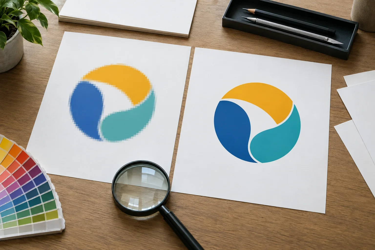
Even high-quality artwork can cause production problems when the design itself isn't suited to the selected product or decoration method.
A logo that looks beautiful on a large sign may not work the same way when reduced to fit a pen barrel or embroidered onto a hat.
Mistake #5: Including Too Much Tiny Detail
Logos sometimes contain small lettering, thin lines, gradients, shadows, detailed illustrations, or decorative elements.
These details may look fantastic when the logo is large.
But when the design is reduced to fit a small promotional product, some elements can become difficult to reproduce or read.
For example, a company tagline might be perfectly readable on a tote bag but nearly impossible to distinguish on a narrow pen barrel.
Why it causes problems: Every decoration method has practical limitations on the smallest details it can reproduce.
What to do instead: Consider using an approved simplified logo, removing unnecessary small details, or choosing a product with a larger imprint area.
Mistake #6: Using the Same Logo Layout for Every Product
Not every logo shape fits every promotional product.
A long horizontal logo may look great on a pen or notebook but appear awkward when squeezed into a small square imprint area.
A tall logo may work beautifully on a tumbler but leave unused space on a wide tote bag.
Why it causes problems: The artwork's proportions may not match the available imprint dimensions.
What to do instead: If your company has approved horizontal, stacked, square, or icon-only logo versions, use the version that best fits the product.
For more information, read how large can my logo print?
Mistake #7: Stretching or Distorting the Logo
Sometimes customers try to make a logo fit an imprint area by stretching it wider or taller.
Unfortunately, this changes the original design.
Circles become ovals, lettering looks unnatural, and the proportions of the logo no longer match the intended branding.
Why it causes problems: Distorted artwork can make the finished product look unprofessional and inconsistent with your company's brand identity.
What to do instead: Preserve the logo's original proportions. If it doesn't fit, reduce its overall size or use an approved alternate version.
Mistake #8: Using Artwork That's Too Complicated for the Decoration Method
Different decoration methods reproduce artwork differently.
For example, a colorful logo with gradients and shadows may work well with an available full color printing method but not with a basic one-color screen print.
A detailed illustration may also be difficult to reproduce with embroidery or debossing.
Why it causes problems: The selected decoration method may not support the artwork's number of colors, gradients, line thickness, or level of detail.
What to do instead: Choose a decoration method that suits your artwork, or consider an approved simplified version of the design.
A great logo doesn't work with every decoration method
Some logos are better suited to full color printing, while others work beautifully with screen printing, embroidery, engraving, or debossing. The goal is to match the artwork to the product and available decoration method rather than forcing a design into a process that cannot reproduce it properly.
For more guidance, read which decoration method should I choose?
What Happens When a Detailed Logo Gets Too Small?
Consider a company logo containing a decorative symbol, company name, and small tagline.
On a large tote bag, the full design might reproduce beautifully.
On a slim promotional pen, however, the tagline may become unreadable and the decorative details may lose definition.
The solution isn't necessarily to create a completely new logo.
An approved simplified version might use just the company name and symbol, allowing the most important branding elements to remain clear.
Detailed Artwork vs. Simplified Artwork
A simplified logo can sometimes produce a clearer result on small promotional products.
Full Detailed Logo
- Company name and tagline
- Decorative lines or illustrations
- Multiple small design elements
- Works best when enough imprint space is available
Approved Simplified Logo
- Focuses on the most important elements
- Uses cleaner, more readable shapes
- May omit tiny secondary text
- Can work better on small imprint areas
Any simplification should preserve the intended branding and be approved before production.
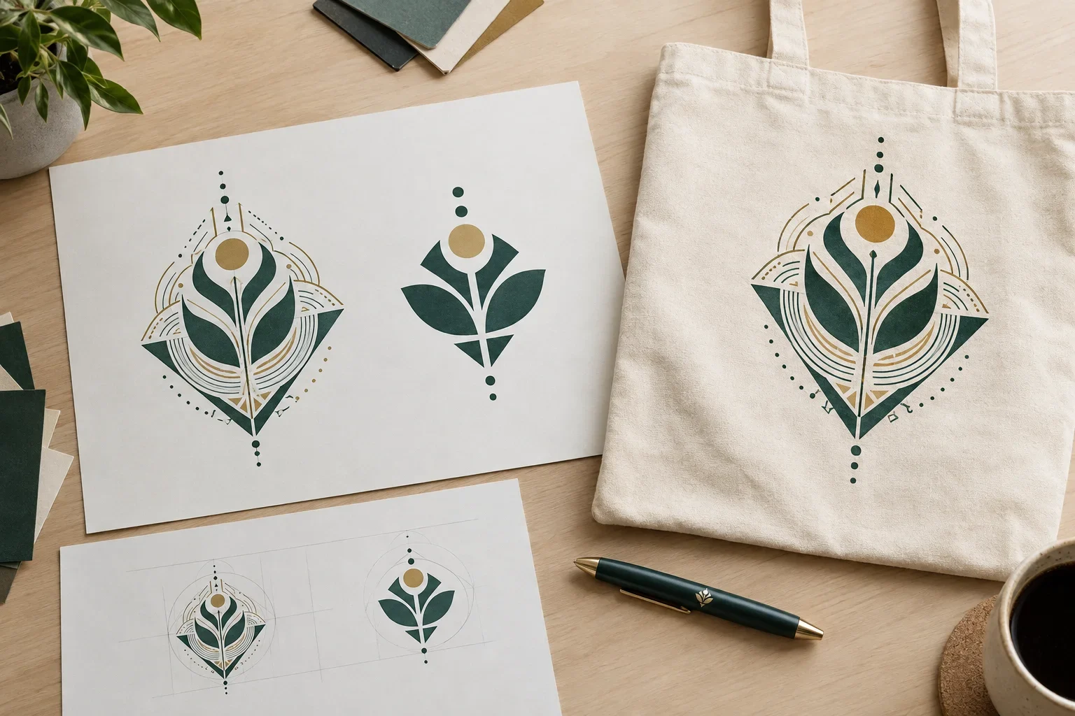
Color and Printing Mistakes
Artwork problems aren't always about resolution or design complexity.
Colors can also create confusion, especially when customers expect printed products to match exactly what they see on their computer screens.
Mistake #9: Assuming Screen Colors Will Print Exactly the Same
Your logo may look bright and vibrant on your computer, but physical printing uses different color reproduction processes.
Computer screens display color using RGB light. Many printing processes use ink, while embroidery uses thread and engraving often changes the material itself.
Some colors that appear vivid on a screen cannot be reproduced exactly using a particular printing method.
Why it causes problems: Different color systems, inks, materials, finishes, and lighting conditions can affect the final appearance.
What to do instead: Provide official brand color information when available, including Pantone references or brand guidelines. Understand that exact matching capabilities vary by product and method.
Learn more in RGB vs. CMYK.
Mistake #10: Assuming Every Product Can Match Your Exact Brand Colors
Some promotional products offer custom Pantone ink matching. Others use standard imprint colors or a full color printing process.
Embroidery relies on available thread colors, while engraving and debossing may not apply colored ink at all.
Why it causes problems: Customers may expect a specific color to be reproduced exactly on products that don't offer the necessary color matching options.
What to do instead: If precise brand color matching is important, communicate that before ordering so the available decoration options can be reviewed.
For more information, read can you match my brand colors?
Mistake #11: Forgetting About the Product's Background Color
A bright logo printed on a white product may look different when printed on black, navy, red, or natural-colored material.
The background color, ink opacity, and printing process can all influence the finished appearance.
Why it causes problems: Some inks and printing methods interact differently with dark or colored surfaces.
What to do instead: Consider the product color alongside your logo colors. An approved light or reversed logo version may be better for certain dark products.
Don't rely on your screen for exact color approval
Digital proofs help confirm artwork and color specifications, but the colors displayed on your monitor aren't guaranteed to match physical ink, thread, or product materials exactly.
Ordering and Proof Approval Mistakes
Even when the artwork is technically perfect, mistakes can still happen during order preparation and approval.
These issues are often among the easiest to prevent because they involve checking information before production.
Mistake #12: Sending Several Logo Files Without Identifying the Correct One
Many businesses have multiple versions of their logos.
There may be an old logo, a new logo, a horizontal version, a stacked version, a one-color version, and several variations created for different marketing materials.
Sending all those files can be helpful, but it's important to identify which version should be used.
Why it causes problems: The wrong logo version may be selected if the artwork instructions aren't clear.
What to do instead: Identify the preferred logo and explain when alternate versions are acceptable.
Mistake #13: Ignoring Imprint Size and Placement
A logo that looks good on a product image may not be printed at the size you imagine.
Every product has specific imprint areas, and those dimensions can vary by decoration method.
Why it causes problems: Customers may assume that a logo can be printed larger or in a different location than the product actually supports.
What to do instead: Review the available imprint dimensions and locations. If size or placement is particularly important, communicate that before approving the artwork.
Mistake #14: Forgetting to Check Spelling and Contact Information
This mistake has nothing to do with vector files, resolution, or printing equipment.
It's simply an incorrect word, website address, phone number, date, or company name.
Unfortunately, these are the kinds of mistakes that can become especially frustrating once products have been decorated.
Why it causes problems: Artwork may contain outdated information or a typing mistake that goes unnoticed during review.
What to do instead: Carefully check every word and number on your artwork proof, even when the information came from a file you supplied.
Mistake #15: Approving the Artwork Proof Too Quickly
An artwork proof is your opportunity to review the decoration before production.
It's tempting to glance at the proof, see your logo, and immediately click approve.
But the important details aren't always obvious at first glance.
Why it causes problems: An incorrect logo version, unexpected imprint size, placement issue, or spelling mistake may not be noticed until after production.
What to do instead: Review the complete proof, including the listed specifications, before approving it.
Approval is an important production milestone
Once artwork is approved, production preparations may begin. Changes requested afterward may cause delays, additional costs, or may no longer be possible depending on the supplier's production status. If something looks wrong or unclear, ask before approving.
For more information, read what is a print proof?
What If You Don't Have Production-Ready Artwork?
If you've recognized several of these mistakes in your own files, don't assume you need to redesign your entire logo.
Often, the first step is simply locating a better version of the artwork.
Try checking with:
- The original graphic designer or branding agency
- Your company's marketing department
- Previous printing or promotional products vendors
- Sign shops or vehicle graphics companies
- Your website designer or developer
- Company brand guidelines and shared marketing folders
If an original vector file exists, it may solve many common artwork quality problems.
If not, some logos can be recreated or adjusted. Others may require a different decoration method or an approved simplified design.
Artwork cleanup and recreation possibilities vary depending on the complexity and quality of the original file.
Which Artwork Problems Can Usually Be Fixed?
Some issues are relatively straightforward to address, while others may require more preparation.
Common Problems and Possible Solutions
Every situation is different, but these are common approaches to artwork troubleshooting.
Blurry Logo
Locate a higher-resolution original or vector file. Some simple artwork may be suitable for recreation.
Wrong File Type
Find the original design file or determine whether the current file works with the selected method.
Tiny Details
Consider an approved simplified version or a product with a larger imprint area.
Wrong Logo Layout
Use an approved horizontal, stacked, or alternate version suited to the imprint area.
Color Limitations
Review available imprint colors, matching capabilities, or other suitable decoration options.
Incorrect Proof
Request corrections before approval and confirm the updated artwork and specifications.
The best solution depends on the product, material, decoration method, and artwork itself.
How Artwork Problems Can Delay an Order
Artwork issues aren't always difficult to resolve, but they can affect how quickly an order is ready for production.
For example, if the supplied logo isn't usable, a better file may need to be located.
If the artwork contains details that can't be reproduced using the selected method, the design may need adjustment or another available option may need to be considered.
If the proof requires corrections, the revised artwork may need to be reviewed again before production.
This is why it's helpful to send artwork early, especially for orders with important event dates.
Ordering for an event?
If you have a firm deadline, provide your artwork and event date as early as possible. Artwork review, revisions, proof approval, and production all require time, and delays in one step can affect the overall schedule.
How Purple Pie Promos Helps Prevent Artwork Problems
Customers shouldn't need to understand every technical aspect of artwork production before ordering promotional products.
That's why artwork review is an important part of the process.
Purple Pie Promos reviews the artwork, product, imprint area, and decoration method before production.
If the selected artwork isn't suitable for the product or method, we can help explain what needs to change.
That might mean requesting a better logo file, reviewing an approved alternate version, or discussing a different available decoration option.
The goal is to identify artwork issues before products are decorated, when there is still an opportunity to address them.
From Artwork Submission to Production
A simple overview of how artwork issues can be identified before production.
Common Artwork Questions
What if I only have a JPG of my logo?
Send the highest-quality JPG you have. It may work for some decoration methods, particularly if it's high resolution. For other methods, a vector file or artwork adjustment may be needed.
Can I use a logo copied from my website?
A website logo can be helpful for reference, but it may be too small or compressed for production. If possible, locate the original design file.
Can you make my blurry logo sharper?
Some artwork can be cleaned up or recreated, depending on its complexity and the quality of the original. However, a blurry image cannot always be restored perfectly.
Will vector artwork fix every printing problem?
No. Vector artwork helps maintain clean edges when resized, but physical decoration methods still have limitations involving line thickness, small lettering, materials, and imprint size.
Can I use the same logo file for embroidery and screen printing?
The same original logo may be a useful starting point for both methods, but the production preparation is different. Embroidery requires stitch digitizing, while screen printing requires artwork suited to the available printing process.
What if my logo has too many colors?
The best option depends on the selected product. Some decoration methods support multiple solid colors, while others offer full color printing or transfers. Not every method is available for every item.
Can I fix mistakes after approving my proof?
Changes may be possible depending on the supplier's production status, but they aren't guaranteed. It's important to request corrections before approving the artwork.
Do I need to hire a graphic designer before ordering?
Not necessarily. If you already have a logo, start by sending the best available file. Artwork requirements can be reviewed before determining whether additional design work is necessary.
Artwork Mistakes Checklist
Before submitting artwork for custom promotional products, use this checklist to avoid the most common problems.
- Send original logo files whenever possible.
- Use vector artwork for logos when available.
- Avoid using screenshots or tiny website images as final production artwork.
- Remember that PNG and JPG files are raster images, even when they have transparent backgrounds.
- Don't assume every PDF contains vector artwork.
- Check whether small lettering and detailed elements will fit the imprint area.
- Preserve the logo's original proportions.
- Use an approved alternate logo layout when appropriate.
- Provide brand color specifications when available.
- Understand the color and artwork limitations of the selected decoration method.
- Identify the correct logo version when sending multiple files.
- Review the imprint dimensions and placement.
- Check every word, number, website address, and date on the proof.
- Request corrections before approving production.
- Provide artwork early when ordering for a specific event or deadline.
For a complete preparation guide, visit our artwork checklist before ordering.
The Bottom Line
Common artwork mistakes can affect printing quality, delay production, or create results that don't match your expectations.
Low-resolution logos, screenshots, incorrect file formats, overly detailed designs, color mismatches, and overlooked proof details are among the most frequent problems.
Fortunately, many of these issues can be identified before production.
Using clean original artwork, choosing appropriate decoration methods, and carefully reviewing your proof can make the ordering process much smoother.
And if you're not sure whether your artwork is ready, you don't need to figure everything out yourself.
Good artwork preparation prevents expensive surprises
The best way to avoid artwork problems is to use the highest-quality files available and make sure the design works with the selected product and decoration method.
Purple Pie Promos reviews artwork before production and can help identify potential issues before your custom products are decorated.

Not sure if your artwork is ready for printing?
Purple Pie Promos can help review your logo files, imprint area, and available decoration options before production. Whether you have a professional vector logo or just a PNG from your website, send the best artwork you have and we'll help determine what is needed.
Request Artwork Help