

Quick Answer
Your logo usually looks blurry because the artwork file is too small, low resolution, compressed, or enlarged beyond its original size. Screenshots, website logos, email signature images, and small JPG or PNG files are common causes. For promotional products, vector artwork is usually the best solution because it can be resized without becoming pixelated. High-resolution raster files can also work for some full color printing methods.
You have a logo. It looks great on your website, in your email signature, and on your computer. Then you try to order custom shirts, pens, tumblers, or tote bags, and someone tells you the artwork is blurry or too low resolution.
What happened?
Usually, nothing happened to the logo itself. The problem is that the file you have was not necessarily created for printing. A small image that looks sharp on a phone or computer screen may not contain enough detail to reproduce cleanly on a physical product.
The good news is that blurry artwork does not automatically mean you need a new logo. Sometimes a better version already exists. Sometimes the artwork can be recreated or cleaned up. In other situations, the decoration method or imprint size may need to be adjusted.
This guide explains why logos become blurry, how to recognize different artwork problems, and what to do when your logo is not ready for production.
Don't worry if your artwork isn't perfect
Many customers only have a PNG, JPG, PDF, or logo copied from their website. Purple Pie Promos reviews artwork before production and can help determine whether your file is suitable for the product and decoration method. If a better file or adjustment is needed, we will help guide you before the order moves forward.
What Does a Blurry Logo Actually Mean?
People often use the word "blurry" to describe several different artwork problems. Understanding what the logo looks like can help identify the cause.
Common Logo Quality Problems
Different artwork problems have different causes and possible solutions.
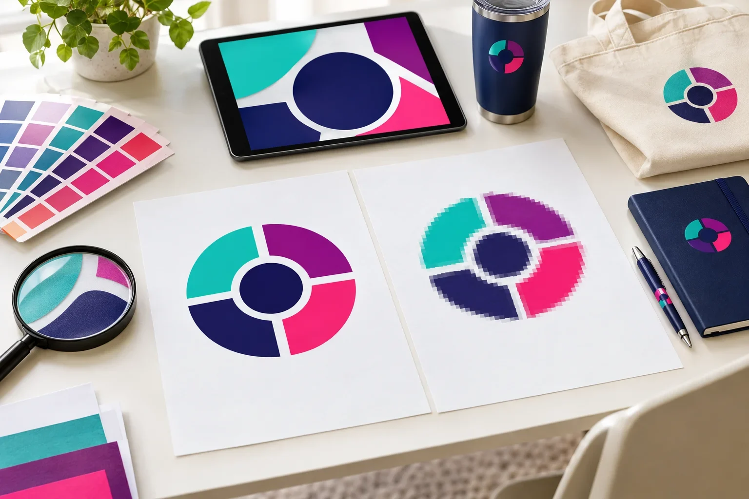
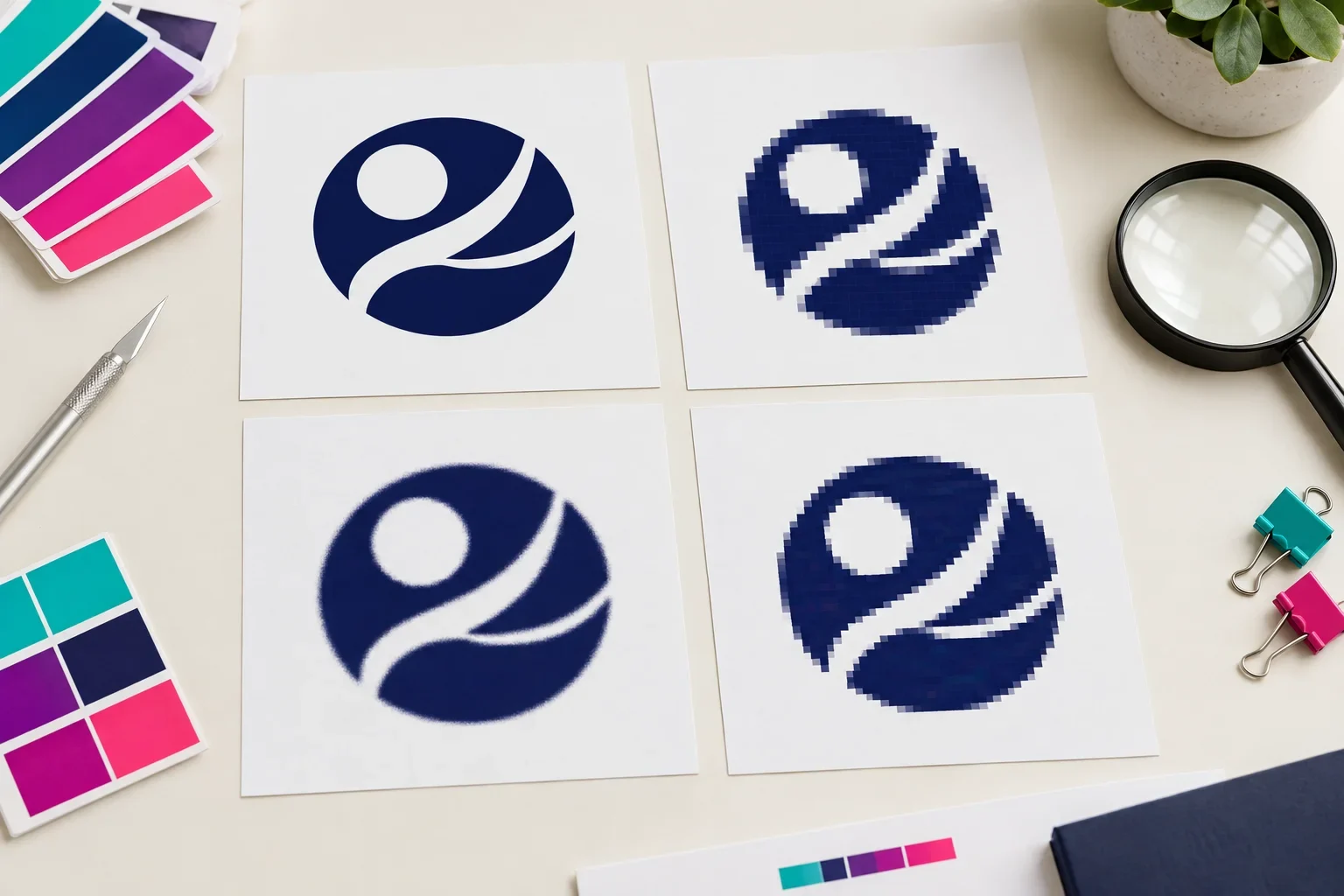
Pixelated
The logo has blocky or stair-stepped edges because individual pixels become visible when enlarged.
Fuzzy
The edges look soft or slightly out of focus instead of clean and defined.
Jagged
Curves, circles, and diagonal lines have rough edges instead of smooth outlines.
Compressed
The artwork has strange blocks, halos, or visual noise around text and shapes.
Hard to Read
Small lettering or thin details become difficult to recognize at the intended imprint size.
Distorted
The logo has been stretched, squashed, or resized incorrectly, changing its proportions.
These problems can have different solutions. Pixelation may require a higher-resolution file or vector artwork. Compression artifacts may require an original image. Tiny details may need to be simplified, even if the original file is high quality.
Why Does My Logo Look Fine on a Screen but Blurry When Printed?
Computer screens and physical printing have different requirements.
A small logo may look sharp on your website because it is being displayed at a small size. Your phone may make it look especially clean because the image is packed into a relatively small viewing area.
But promotional products often require artwork to be enlarged or prepared for a specific printing process.
For example, a logo originally saved for a tiny website header may not contain enough detail to print several inches wide on a tote bag. The screen version may appear acceptable, but enlarging it exposes the limited number of pixels in the original image.
A simple way to understand it
A logo can look sharp when it is small because you cannot easily see the individual pixels. When the same image is enlarged, those pixels become more noticeable, and the logo can start looking blurry or jagged.
The Most Common Reasons Logos Become Blurry
Most blurry logo problems come from a handful of common situations. Fortunately, many can be identified before your order reaches production.
1. The Original File Is Too Small
Small image files contain a limited number of pixels. When they are enlarged, the software has to stretch or estimate the existing image information.
This can make curved lines look jagged, small text look fuzzy, and solid shapes lose their clean edges.
A logo that was originally saved for a website icon or email signature may not have enough detail for a larger promotional product imprint.
2. The Logo Was Copied From a Website
Website images are often optimized to load quickly. That can mean smaller dimensions or compressed files.
Even when a logo looks beautiful on a website, the displayed image may not be the original high-quality artwork.
If you need production artwork, it is usually better to locate the original logo file rather than right-clicking and saving the image from a website.
3. The Artwork Is a Screenshot
Screenshots capture what is visible on a screen. They do not preserve the original vector paths or recover detail that was not visible in the displayed image.
A screenshot may also include unwanted background colors, shadows, compression artifacts, or rough edges.
Screenshots are useful for showing which logo you want, but they are rarely the best starting point for professional decoration.
4. The Image Was Compressed
Some image formats use compression to reduce file size. JPG files, in particular, can lose image detail when repeatedly saved or exported with heavy compression.
This can create fuzzy edges, strange patterns, or halos around lettering and shapes.
PNG files use lossless compression, but a PNG can still be low resolution if it was originally exported at a small size.
5. The Logo Was Enlarged Too Much
Enlarging a small raster image does not automatically create more real detail.
For example, taking a small JPG logo and stretching it across a large tote bag imprint may cause the edges to look soft or blocky.
The file dimensions become larger, but the original artwork does not gain the clean shapes and precise detail of a properly prepared file.
6. The Artwork Was Exported Incorrectly
Sometimes the original design is perfectly good, but the exported file is not.
A designer may have created a clean vector logo but exported a small PNG for a website. If that PNG is later used for promotional products, the artwork quality may be limited even though a better original exists.
This is why asking for the original design file can be more helpful than trying to repair a low-quality export.
What Is Image Resolution?
Resolution describes how much image detail a raster file contains. Raster images are built from pixels, and the number of pixels available affects how large the image can be reproduced while remaining sharp.
Two common terms you may encounter are PPI and DPI.
Understanding Resolution
Resolution helps determine whether raster artwork has enough detail for the intended imprint size.
Pixels
The tiny colored squares that make up a raster image. More useful pixels generally allow for larger, sharper reproduction.
PPI
Pixels per inch. This describes how densely image pixels are used at a particular physical size.
DPI
Dots per inch. Technically a printer output measurement, although the term is often used informally when discussing artwork resolution.
Print Size
The physical dimensions of the final imprint. Enlarging a raster image reduces its effective pixels per inch.
For many conventional print applications, 300 PPI at the final print size is a useful general target for raster artwork. However, promotional product decoration methods have different requirements. Some methods may accept lower resolution, while others need vector artwork or specialized production files.
There is no single resolution that guarantees every logo will print perfectly on every product.
Changing the resolution setting does not automatically fix an image
If a small image is changed from 72 PPI to 300 PPI without adding genuine detail, it does not magically become better artwork. The actual pixel dimensions, image quality, and intended print size still matter.
Why Vector Artwork Is Usually the Best Solution
For most logos, vector artwork is the preferred starting point because it is built from paths and shapes rather than a fixed grid of pixels.
That means the same vector logo can be resized for different imprint areas without becoming pixelated.
Vector artwork is especially helpful for promotional products because your logo may need to appear on many different items.
Vector vs. Low-Resolution Raster Artwork
The difference becomes especially noticeable when artwork needs to be enlarged.
Vector Artwork
- Built from clean paths and shapes
- Stays sharp when enlarged
- Usually best for logos
- Helpful for many decoration methods
- Common formats include AI, EPS, SVG, and vector PDF
Low-Resolution Raster
- Built from a limited number of pixels
- Can become blurry when enlarged
- May contain rough or fuzzy edges
- May require cleanup or replacement
- Common examples include small JPGs and PNGs
For more information, read what is vector artwork? and vector vs. raster images.
Can You Fix a Blurry Logo?
Sometimes. The best solution depends on why the artwork is blurry and whether a better original file exists.
Some artwork problems are relatively straightforward. Others require a cleaner file, manual recreation, or changes to the design.
Possible Solutions for Blurry Artwork
The right approach depends on the original file and how the logo will be decorated.
Find the Original File
An original vector logo is usually the best solution when available.
Use a Higher-Resolution Image
A larger, sharper version may work for certain full color printing methods.
Recreate the Artwork
Some simple logos can be manually redrawn as clean vector shapes.
Simplify the Design
Removing tiny details or using an approved simplified logo can improve reproduction on small items.
Adjust the Imprint Size
A smaller imprint may reduce enlargement problems, although details still need to remain readable.
Review the Decoration Method
A different available method may be better suited to detailed or full color artwork.
Where Can I Find a Better Logo File?
Before trying to repair blurry artwork, check whether a better version already exists. Many businesses have original logo files but do not realize where they are stored.
Good places to look include:
- The graphic designer or branding agency that created your logo
- Original logo packages or company brand folders
- Brand guidelines and marketing asset folders
- Previous screen printers or embroidery companies
- Sign shops or vehicle graphics companies
- Business card or commercial printing vendors
- Original website design files
- Shared company drives and older marketing folders
Ask for the original AI, EPS, SVG, or vector PDF file if one is available.
If you are unsure which version is best, you can send multiple files for review.
Can a Blurry JPG or PNG Be Converted to Vector?
Sometimes, but the results depend heavily on the source artwork.
Simple logos with clean shapes and limited colors are often easier to recreate than complex designs containing gradients, textures, shadows, photographs, or tiny details.
Some design software can automatically trace raster artwork into vector shapes. However, automatic tracing does not always produce clean results.
If the original image is blurry, the software may trace the blurry edges rather than recreate the intended smooth shapes. This can produce uneven curves, extra points, distorted letters, or inaccurate details.
For some logos, manual recreation may be a better approach.
Saving a JPG as an EPS does not make it vector
Changing the file extension or placing a blurry image inside a PDF, AI, or EPS file does not automatically improve its quality. The artwork itself needs to contain clean, usable image information or genuine vector paths.
Can AI Improve a Blurry Logo?
AI image enhancement and upscaling tools can sometimes make a low-resolution image appear sharper. However, they may estimate or invent details rather than accurately restore the original design.
This matters for logos because small differences can change lettering, curves, proportions, spacing, or other brand elements.
AI enhancement may be useful as part of an artwork cleanup process, but it should not be assumed to produce an accurate, production-ready replacement for the original logo.
For professional branding, a clean original file or carefully recreated vector artwork is generally more reliable.
Why Blurry Artwork Matters for Different Decoration Methods
Artwork quality affects decoration methods differently. A file that may work for one type of printing might not be suitable for another.
Screen Printing
Screen printing often requires clean shapes and clearly defined artwork. Blurry raster images can make color separation and fine details more difficult.
Vector artwork is usually preferred for simple spot color logos.
For more information, read why can't every logo be screen printed?
Embroidery
Embroidery requires artwork to be converted into stitches. A blurry file may make it difficult to identify the intended edges, shapes, and lettering.
Even clean vector artwork may need simplification if the logo contains tiny text, thin lines, or details that cannot be reproduced well with thread.
Read more about embroidery vs. screen printing.
Laser Engraving
Many logo engraving applications benefit from clean, well-defined artwork. Fuzzy edges and unclear lettering can make preparation more difficult.
Engraving results also depend on the product material, coating, and engraving process. Good artwork is important, but it does not remove the physical limitations of the product.
Full Color Digital Printing
Some full color printing methods can use high-resolution raster artwork, including certain PNG, JPG, TIFF, or other image files.
However, the artwork still needs enough resolution for the intended imprint size. A tiny website image may not produce a sharp full color print simply because the decoration method supports full color.
Debossing and Embossing
Debossing and embossing rely on defined shapes being pressed into or raised from a material.
Clean vector artwork is usually preferred. Small gaps, thin lines, and complicated details may need adjustment before the design can be reproduced clearly.
Read more about deboss vs. emboss.
What If My Logo Is Sharp but Still Doesn't Print Clearly?
A high-quality artwork file is important, but it does not guarantee every detail will reproduce perfectly on every promotional product.
Sometimes the issue is not the file resolution. It is the size of the imprint, the decoration method, or the product material.
For example, a detailed logo may look beautiful on a large tote bag but become difficult to read on a narrow pen barrel. A thin line may appear perfectly sharp in a vector file but be too delicate for certain embroidery or engraving processes.
Other Reasons a Sharp Logo May Not Reproduce Well
Artwork quality is only one part of successful promotional product decoration.
Small Imprint Area
Fine details may become difficult to reproduce when the logo is reduced to fit.
Thin Lines
Some decoration methods have minimum line thickness requirements.
Tiny Text
Small lettering may be technically sharp in the file but unreadable on the product.
Product Texture
Fabric, textured surfaces, coatings, and curved items may affect how details appear.
Decoration Method
Some methods cannot reproduce every gradient, shadow, line, or fine detail.
Logo Complexity
A simplified version may work better when the full design contains too much detail.
For more information about imprint limitations, read how large can my logo print? and why artwork quality matters.
Will a Print Proof Show If My Logo Is Blurry?
A print proof helps show your logo's placement, approximate size, layout, colors, and general appearance before production.
It may also reveal visible artwork issues, such as fuzzy lettering, unclear details, or incorrect proportions.
However, a proof does not automatically fix poor artwork, and a digital proof may not show every limitation of the final production process.
It is important to review both the artwork quality and the proof before approving production.
What to Check on Your Artwork Proof
A careful proof review can help catch problems before production begins.
Logo Sharpness
Does the artwork appear clean, or are there visible fuzzy or jagged edges?
Text Readability
Is the company name, website, or other lettering readable at the intended size?
Logo Proportions
Does the logo look correct, without being stretched or distorted?
Imprint Size
Is the logo appropriately sized for the product and available imprint area?
Placement
Is the logo positioned where you expect it to appear?
Correct Version
Is the approved logo version being used, with the correct artwork and colors?
For a detailed explanation, read what is a print proof?
What Should I Do If I Only Have a Blurry Logo?
If the only logo file you have is blurry, you can still begin by sending it for review.
There is no need to guess which file type to convert it into or spend time trying random image enhancement tools before asking for help.
What to Do With a Blurry Logo
A simple process can help identify the best available solution.
Some files can be used as they are. Others may need cleanup, recreation, or an alternative logo version.
The right solution depends on the artwork, product, and decoration method.
Common Mistakes That Make Logos Look Worse
When customers discover that their artwork is blurry, they sometimes try to fix it themselves. Some approaches help, but others simply create a larger file with the same problems.
- Enlarging a small JPG or PNG and assuming the image quality will improve
- Changing a file extension from JPG to PDF or EPS without changing the artwork
- Increasing the PPI setting without adding genuine image detail
- Taking screenshots of a logo instead of locating the original file
- Using images copied from websites or social media as production artwork
- Saving and resaving heavily compressed JPG files
- Using automatic vector tracing without reviewing the resulting shapes
- Using AI enhancement without checking for altered lettering or logo details
- Stretching a logo out of proportion to fit an imprint area
- Assuming vector artwork guarantees that every tiny detail can be printed
- Approving a proof without checking the logo at its intended size
For additional tips, read common artwork mistakes.
Artwork Quality Checklist Before Ordering
Before submitting your logo for custom promotional products, use this checklist to help avoid common artwork problems.
Blurry Logo Prevention Checklist
A little preparation can help prevent unnecessary artwork delays.
Use the Original File
Send original AI, EPS, SVG, or vector PDF artwork when available.
Check Image Quality
If using PNG or JPG artwork, choose the largest and sharpest original version.
Avoid Screenshots
Use screenshots for reference rather than final production artwork whenever possible.
Keep Correct Proportions
Do not stretch or distort the logo to fit a particular space.
Check Small Details
Make sure lettering and fine details are appropriate for the imprint size.
Review Your Proof
Confirm the correct artwork, size, placement, and overall appearance before approving production.
For a more complete preparation guide, visit our artwork checklist before ordering.
The Bottom Line
Blurry logos are usually caused by low-resolution artwork, small image dimensions, compression, screenshots, or enlarging raster images beyond their intended size.
For most promotional product logos, vector artwork is the preferred solution because it can be resized without becoming pixelated. High-resolution raster artwork can also work for some full color printing methods.
If you do not have a better file, that does not necessarily mean you cannot order custom products. Your artwork may be usable for certain methods, or another version or adjustment may be needed.
Purple Pie Promos reviews artwork before production and can help determine whether your logo is suitable for the selected product and decoration method.
A sharp logo starts with the right artwork
The best way to avoid blurry printing is to use clean, high-quality artwork that fits the product and decoration method.
If your logo looks blurry, send the best version you have. We can help determine what is needed before your order moves forward.

Worried your logo isn't sharp enough?
Purple Pie Promos can help review your logo file, product, imprint area, and decoration method before production. Send the best artwork you have, and we will help determine whether it is ready or if a better file or adjustment is needed.
Request Artwork Help