

Quick Answer
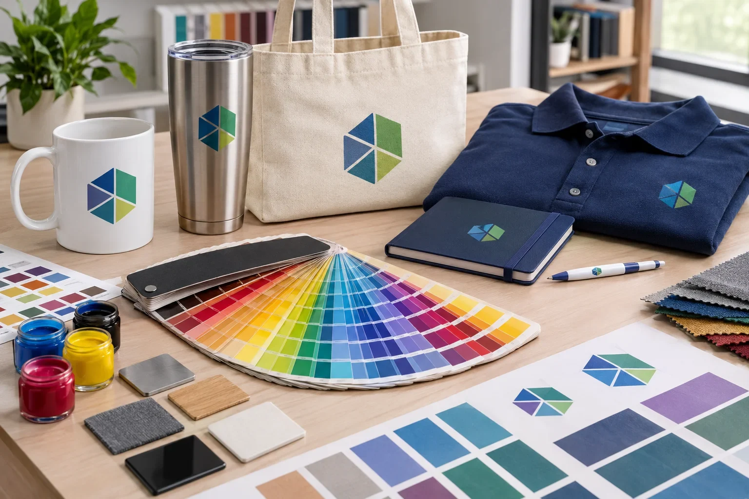
Promotional product colors can vary depending on the product material, decoration method, ink, thread, surface color, and lighting. Pantone (PMS) colors help communicate specific brand colors, but exact matches are not always possible. Screen printing may allow spot color matching, while full color digital printing, embroidery, engraving, and other methods have different color capabilities. Purple Pie Promos can help review your artwork and decoration options to determine what is realistic for your project.
Color is one of the most important parts of a brand. Some companies are flexible about their logo colors. Others have carefully established brand standards and want their colors reproduced as consistently as possible.
The challenge is that promotional products are not all printed on the same surface using the same process.
A logo printed on a white notebook may look different from the same logo embroidered on a navy polo, screen printed on a cotton tote, or engraved on a stainless steel tumbler.
Understanding a few basics about color can help you choose products and decoration methods that better match your expectations.
Can You Match My Exact Brand Colors?
Color matching is possible on many promotional products, but the level of accuracy depends on the product and decoration method.
Traditional spot color printing may allow a printer to use a specific Pantone color or mix an ink to match it. Other processes, such as full color digital printing, embroidery, sublimation, and laser engraving, work differently.
Even when a specific ink color is used, the finished appearance can be affected by the surface it is applied to.
For example, a bright green logo printed on white plastic may appear different from the same green printed on natural cotton or a dark-colored product.
What should you send?
If your brand uses specific colors, provide the Pantone (PMS) numbers whenever possible. If you do not know them, send your original logo files or brand guidelines. Purple Pie Promos can help determine which color options are available for the product and decoration method you select.
What Are Pantone Colors?
Pantone colors are standardized color references used by designers, printers, and manufacturers to communicate specific colors.
Instead of describing a logo as "dark blue" or "bright orange," a company can specify a Pantone color number to communicate a more precise color target.
This is particularly useful for businesses that want consistent branding across printed materials, promotional products, packaging, signs, and apparel.
However, a Pantone number is a color reference, not a guarantee that every material or decoration process can reproduce that color exactly.
Some products support specific Pantone matching, others use a limited selection of standard imprint colors, and some use full color printing processes that simulate the requested color.
For a more detailed explanation, read What Are Pantone Colors?.
What Does PMS Mean?
PMS stands for Pantone Matching System. It is a standardized system commonly used to identify colors for printing and manufacturing.
When a promotional product description asks for a PMS color, it is usually asking for the Pantone reference associated with your logo or desired imprint color.
If you do not have a PMS number, that does not mean you cannot order promotional products. It simply means the available color options may need to be reviewed using your artwork or other references.
Why Do Colors Look Different on Promotional Products?
The same color can look different when printed on different materials because each surface reflects light and interacts with inks, dyes, threads, and coatings differently.
A smooth white plastic surface, textured fabric, glossy ceramic mug, coated metal tumbler, and natural paper notebook will not necessarily reproduce a color in exactly the same way.
Five Things That Can Change How a Color Looks
The color in your artwork is only one part of the finished result.
Product Material
Fabric, metal, plastic, ceramic, glass, and paper absorb or reflect light differently.
Product Color
A logo printed on a white product may look different from the same logo printed on black, navy, or natural-colored material.
Decoration Method
Screen printing, digital printing, embroidery, sublimation, engraving, and transfers produce different visual results.
Surface Finish
Glossy, matte, textured, metallic, and soft-touch surfaces can change how colors are perceived.
Lighting
Colors can appear different in sunlight, fluorescent lighting, warm indoor lighting, and on computer screens.
For more information, read Why Do Colors Look Different on Products?.
Why Does My Logo Look Different on My Computer Than It Does in Print?
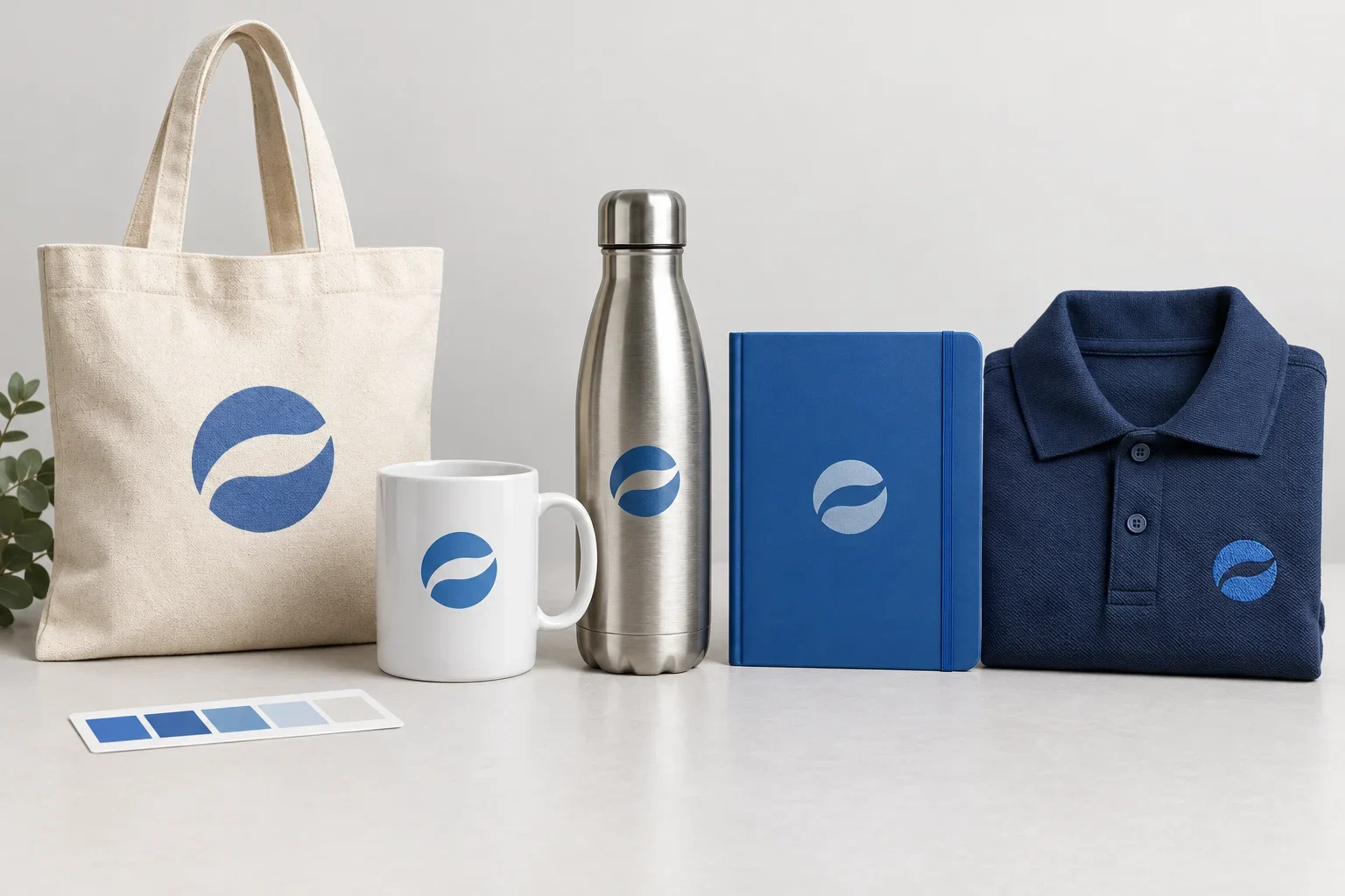
Computer monitors, phones, and tablets create colors using light. Printed products create color through inks, dyes, threads, coatings, or other physical processes.
This difference explains why a color that looks bright and vibrant on your screen may appear less intense when printed.
Screen settings also matter. Two people viewing the same artwork on different monitors may see slightly different colors.
For this reason, a digital proof is useful for reviewing artwork placement and general appearance, but it should not be treated as an exact representation of the finished imprint color.
What Is the Difference Between RGB and CMYK?
RGB and CMYK are two different ways of creating color.
RGB stands for Red, Green, and Blue. It is used for digital displays, including computer monitors, phones, and televisions.
CMYK stands for Cyan, Magenta, Yellow, and Key (Black). It is used in many printing processes to reproduce colors using combinations of ink.
RGB vs. CMYK
Screen colors and printed colors are created in different ways.
RGB: Screen Color
- Uses red, green, and blue light
- Common for websites and digital artwork
- Can display very bright, saturated colors
- Appearance varies by screen and settings
CMYK: Print Color
- Uses cyan, magenta, yellow, and black inks
- Common in many full color printing processes
- Some bright RGB colors cannot be reproduced exactly
- Appearance depends on ink, material, and production
Not every promotional product uses CMYK printing. Some products use spot color inks, embroidery thread, sublimation dyes, UV printing, or other processes.
For a deeper explanation, read RGB vs. CMYK.
Can I Print My Logo in Full Color?
Yes, many promotional products offer full color decoration.
Full color printing is useful for logos with several colors, gradients, shading, photographic elements, or detailed designs that would be difficult to reproduce with traditional spot color printing.
Common full color methods include digital printing, full color transfers, decals, dye sublimation, and direct-to-film printing.
The available method depends on the product and material. Some promotional products support full color printing, while others are limited to specific imprint methods.
Importantly, full color printing does not automatically mean exact Pantone matching. A digital process may approximate your brand colors using its available inks and color profile.
Is Full Color Printing the Same as Printing With Multiple Spot Colors?
No. Although both methods can create colorful logos, they work differently.
Spot color printing generally applies individual ink colors separately. Each additional color may require its own setup or production steps.
Full color printing uses a process designed to reproduce a wide range of colors, often from digital artwork, rather than treating every visible color as a separate spot color.
For example, a logo with four solid colors might be reproduced using four separate spot colors on a compatible product. The same logo might also be printed using a full color digital method if the product supports it.
Neither method is automatically better. The product, artwork, desired color accuracy, quantity, and available decoration options determine which approach makes sense.
For more information, read Full Color Digital vs. Full Color Transfer and Why Does Each Print Color Cost More?.
Why Do Colors Look Different on Dark Products?
Dark product colors can affect how printed artwork appears, particularly when the decoration method does not create a fully opaque imprint.
For example, a bright yellow logo may stand out clearly on a white tote bag but require a different printing approach to appear equally bright on a black tote.
Some decoration methods use an opaque ink or a white underbase beneath the artwork to improve visibility on dark materials. Other methods have different limitations.
Dark apparel may also require additional preparation, ink, or production steps depending on the decoration process.
Product color matters as much as logo color
If your logo uses dark colors, it may not show clearly on a dark product. Sometimes using a white, reversed, simplified, or alternative logo version produces a better result. Purple Pie Promos can help review the available options before production.
Can Embroidery Thread Match My Brand Colors?
Embroidery thread is available in many colors, and it is often possible to find a close match to a company's brand colors.
However, embroidery does not work like ink printing. Thread colors are selected from available thread collections, and a specific Pantone ink color may not have an exact thread equivalent.
Thread also reflects light differently from printed ink. The direction of the stitches, fabric texture, thread sheen, and garment color can affect the finished appearance.
If brand color consistency is important, provide your Pantone references and ask about available thread colors.
For more information about embroidery, read Embroidery vs. Screen Printing.
Does Laser Engraving Produce Different Colors?
Laser engraving typically creates its appearance by marking or removing the surface of a product rather than applying colored ink.
On a powder-coated stainless steel tumbler, engraving may expose the underlying metal. On other materials, the laser may darken, lighten, or alter the surface.
The resulting color depends on the product material, coating, and engraving process.
Traditional laser engraving is not a method for reproducing a full color logo. If your design requires specific brand colors, another decoration method may be more appropriate.
What About Debossing and Embossing?
Debossing and embossing create an impression in the product material rather than reproducing a logo with standard printed ink.
Debossing creates a recessed design, while embossing creates a raised design.
The finished appearance is often influenced by the color and texture of the material itself. A logo debossed into a notebook cover may create a subtle tone-on-tone effect instead of a contrasting printed color.
Some products may offer foil stamping or other color-enhancing options, but availability depends on the item.
Learn more in Deboss vs. Emboss.
Can I Use a Different Logo Color on Different Products?
Yes. Many companies maintain multiple approved logo versions for different applications.
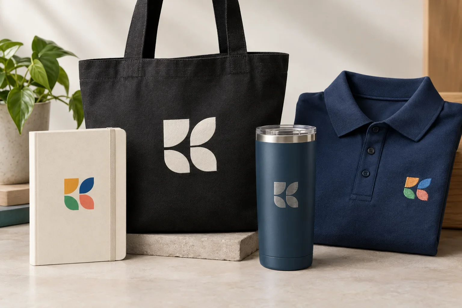
For example, a company may use its full color logo on a white notebook, a white logo on a dark tote bag, a one-color logo on a pen, and an engraved version on stainless steel drinkware.
Using different approved logo versions can help maintain visibility and a consistent brand identity across products with different materials and decoration limitations.
One Brand, Different Decoration Needs
The goal is recognizable branding, even when the exact decoration changes.
White Notebook
A full color logo may work well with an available digital printing method.
Black Tote Bag
A white or light-colored logo may provide better contrast than dark artwork.
Metal Tumbler
An engraved logo may offer a subtle finish without reproducing the original ink colors.
Embroidered Polo
Available thread colors can be selected to complement the brand and garment.
Will My Logo Colors Match Across Different Orders?
Color consistency can vary between orders, especially when products come from different suppliers or use different decoration methods.
Even when the same Pantone reference is provided, variations in ink, materials, production equipment, coatings, thread, and printing conditions may produce slightly different results.
If consistency across multiple products or repeat orders is especially important, provide the same brand color references and approved artwork for each order.
It can also help to keep records of previously approved proofs, decoration specifications, and any physical samples used for reference.
Does the Product Color Have to Match My Logo Color?
No. Your promotional product does not have to be the exact same color as your logo.
Sometimes a contrasting product color makes the logo more visible. Other times, a coordinated tone-on-tone approach creates a more subtle, premium appearance.
For example, a company with a blue logo may choose white, gray, black, or another complementary product color rather than trying to match the exact blue of its branding.
This can be especially helpful when the product manufacturer does not offer a color that closely matches your brand.
Can I Request a Custom Product Color?
Some promotional products may offer custom manufacturing colors, but this is different from choosing a custom imprint color.
Custom product colors may require larger quantities, additional production time, special manufacturing arrangements, or higher costs.
Most promotional products are offered in a selection of standard product colors. Matching the actual product material to a specific brand color may not be possible unless the item supports custom manufacturing.
Can I See a Color Sample Before Ordering?
Samples may be available depending on the product and supplier.
A blank product sample can help you evaluate the actual product color, texture, material, and finish.
A decorated sample may provide additional information about the imprint appearance, but decorated or pre-production samples are not available for every product and may add cost or production time.
If color accuracy is especially important, ask about sample options early in the ordering process.
Does the Digital Proof Show Exact Colors?
No. A digital proof is primarily used to confirm artwork, placement, size, imprint location, and production details.
The colors displayed on a digital proof may not exactly match the finished product because screens use RGB light while physical decoration uses ink, thread, engraving, dye, or other production processes.
Even a carefully prepared digital proof can appear different on two monitors.
If a proof lists a Pantone number, thread color, or specific imprint color, review those specifications rather than relying only on how the color appears on your screen.
For more guidance, read What Is a Print Proof? and Proofs FAQ.
What If I Don't Know My Brand Colors?
That is fine. Many customers do not know the exact Pantone numbers associated with their logos.
If you have a brand guide, original logo artwork, or files from your graphic designer, those are often good places to find color information.
If you cannot find specific color references, send the best artwork you have. Purple Pie Promos can review the file and help you understand the available decoration options.
Keep in mind that estimating a color from a screenshot or website image is not the same as identifying an official brand color.
How Can I Get the Most Consistent Results?
Consistent branding starts with clear artwork, accurate color references, and choosing decoration methods that make sense for the product.
Brand Color Checklist
A few simple steps can help reduce unexpected color differences.
Common Color Matching Mistakes
Many color problems start with expectations rather than actual production errors. Knowing what to look for can help prevent surprises.
- Assuming colors on a computer screen will look identical when printed
- Expecting every decoration method to support exact Pantone matching
- Assuming a digital proof shows the final physical color precisely
- Using a screenshot instead of original brand artwork
- Choosing a dark logo for a dark product without considering contrast
- Expecting embroidery thread to match printed ink perfectly
- Expecting laser engraving to reproduce a full color logo
- Assuming identical colors will look the same on fabric, plastic, metal, and paper
- Confusing a custom imprint color with a custom manufactured product color
- Not sharing important brand color requirements before production
The Bottom Line
Matching brand colors on promotional products is not always as simple as selecting a color from a screen. Different materials, decoration methods, product colors, and production processes can affect the final appearance.
Pantone references, original artwork, and clear decoration instructions help communicate the desired color. However, exact matches may not be possible on every product.
The goal is to choose products and decoration methods that represent your brand well while understanding what each process can realistically produce.
Consistent branding is about more than a color number
The product, material, decoration method, logo version, and color reference all contribute to the finished appearance.
Purple Pie Promos can help review your artwork and decoration options so you understand what to expect before your order moves into production.
Have questions about your logo colors?
Purple Pie Promos can help review your brand colors, artwork, product selection, and available decoration methods so your finished promotional products represent your brand as well as possible.
Ask About Color Matching